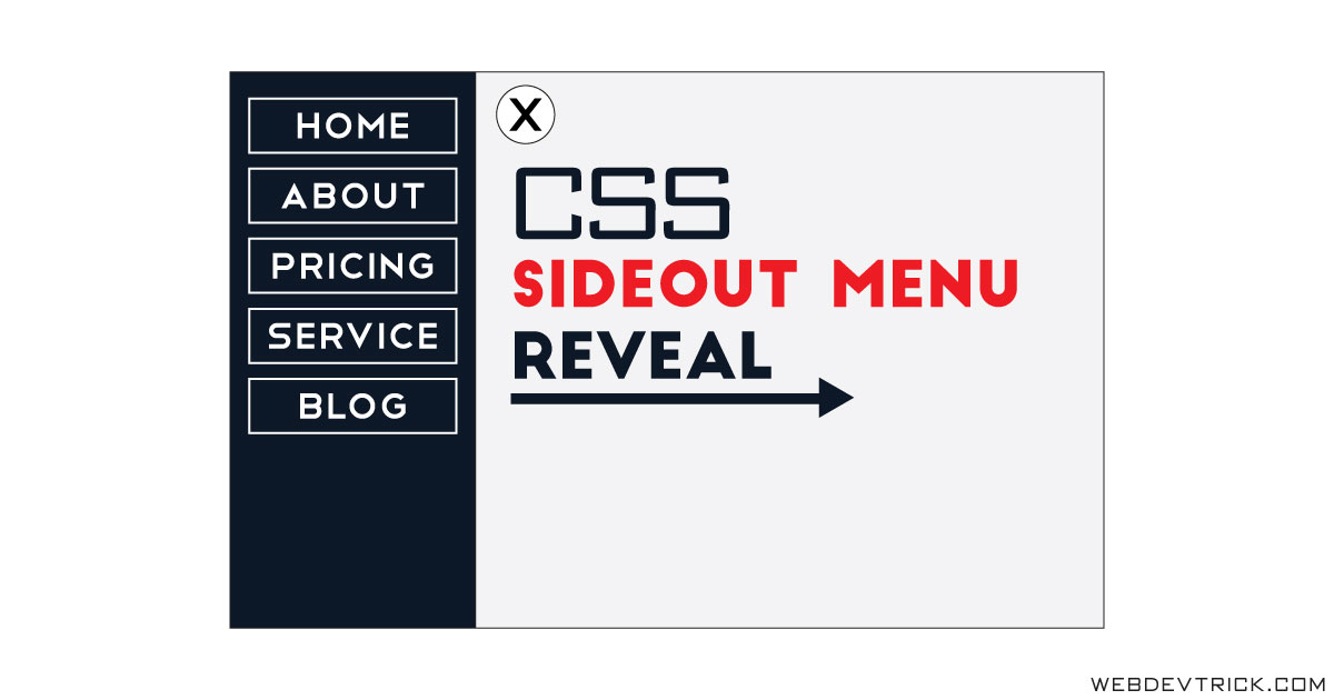
How we can create a sideout menu bar using pure CSS? Solution: CSS Sidebar Menu With Flexbox, Pure CSS Sidenav without JS.
Previously I have shared a dropdown navbar, now its time to create side navbar. Basically, sidenav is a sideout navigation menu which reveals from the left or right side. Nowadays most peoples prefer a sidebar menu because of its look very amazing and attractive.
Today you will learn to create a Pure CSS Sidenav bar without using JavaScript. There is a menu icon and some text on the webpage, but when you will click on the menu icon then side navbar will appear from the left. When the menu will appear, then the other contents will be slide and shift from the left side.
So, Today I am sharing CSS Sidebar Menu With Flexbox. I have created the program using some advance CSS method, I think the codes can help beginners to know CSS in depth. You can use this program on your website or project after a few changes. Also, you can redesign to take this sidebar menu on next level.
If are you thinking now how this side nav menubar actually is, then see the preview given below.
Preview Of Pure CSS Sidenav
See this video preview to getting an idea of how this side menu looks like.
LIVE DEMONow you can see this visually, here also a live demo click on the button above to see the demo. If you like this, then get the source code of its.
You May Also Like:
- Gradient Direction Navigation
- HTML CSS Pagination Design
- Toggle Switch With Checkbox
- Stylish Blockquote Design
CSS Sidebar Menu With Flexbox Source Code
Before sharing source code, let’s talk about it. First, I have created a div with the class name ‘container‘ and placed all the elements inside it. For the menu and close icons, I have created a checkbox input first then create two labels for two icons. There has a big part of HTML Data-* attribute for storing custom data.
Check out how I have stored custom data for input and label: <input data-function="swipe" id="swipe" type="checkbox"> <label data-function="swipe" for="swipe"> . After that I have created another div for the heading and texts. The menu based on HTML list type <li> tag, placed the list inside a div.
Now in the CSS file, first gave 0% width in the lists. Then put a condition when checkbox will checked then the sidebar width will 280px; and other content slide 280px to the right side. And for the icons change, first gave display:none; value to the cross icon, then put another condition when input checked then it will display and hide another icon. Selected the icons using CSS :nth-child() (info) property.
There are left many other basic properties, I can’t explain all in writing. I am just talking about the main things. You will understand the whole concept easily after getting the codes. For creating the program you have to create only 2 files, one for HTML and one for CSS.
Follow the steps to creating this sidebar menu without any trouble.
index.html
Create an HTML file named ‘index.html‘ and put these codes given here below.
|
1 2 3 4 5 6 7 8 9 10 11 12 13 14 15 16 17 18 19 20 21 22 23 24 25 26 27 28 29 30 31 32 33 34 35 36 37 38 |
<!DOCTYPE html> <!--Code By Webdevtrick ( https://webdevtrick.com )--> <html lang="en" > <head> <meta charset="UTF-8"> <title>Pure CSS Off Canvas Menu</title> <link rel="stylesheet" href="style.css"> <link href="https://netdna.bootstrapcdn.com/font-awesome/4.7.0/css/font-awesome.css" rel="stylesheet"> <link href="https://fonts.googleapis.com/css?family=Open+Sans:300" rel="stylesheet"> <script src="https://cdnjs.cloudflare.com/ajax/libs/prefixfree/1.0.7/prefixfree.min.js"></script> </head> <body> <div class="container"> <input data-function="swipe" id="swipe" type="checkbox"> <label data-function="swipe" for="swipe"></label> <label data-function="swipe" for="swipe"></label> <div class="headings"> <h1>CSS Sideout Menu</h1> <p>Without JavaScript Using Flex<p> </div> <div class="sidebar"> <nav class="menu"> <li><a href="#">Home</a></li> <li><a href="#">About</a></li> <li><a href="#">Services</a></li> <li><a href="#">Pricing</a></li> <li><a href="#">Contact</a></li> <li><a href="#">Blog</a></li> </nav> </div> </div> </body> </html> |
style.css
Now create a CSS file named ‘style.css‘ and put these codes given here.
|
1 2 3 4 5 6 7 8 9 10 11 12 13 14 15 16 17 18 19 20 21 22 23 24 25 26 27 28 29 30 31 32 33 34 35 36 37 38 39 40 41 42 43 44 45 46 47 48 49 50 51 52 53 54 55 56 57 58 59 60 61 62 63 64 65 66 67 68 69 70 71 72 73 74 75 76 77 78 79 80 81 82 83 84 85 86 87 88 89 90 91 92 93 94 95 96 97 98 99 100 101 102 103 104 105 106 107 108 |
/* Code By Webdevtrick ( https://webdevtrick.com ) */ * { margin: 0; padding: 0; box-sizing: border-box; } html, body { height: 100%; } body { font: 12px 'Open Sans', sans-serif; color: #212121; background: #eeeeee; overflow-x: hidden; } .container { display: flex; min-height: 100%; } input[data-function*='swipe'] { position: absolute; opacity: 0; } label[data-function*='swipe'] { position: absolute; top: 30px; left: 30px; z-index: 1; display: block; width: 42px; height: 42px; font: 42px fontawesome; text-align: center; color: #333; cursor: pointer; transform: translate3d(0, 0, 0); transition: transform .3s; } label[data-function*='swipe']:hover { color: #263249; } input[data-function*='swipe']:checked ~ label[data-function*='swipe'] { transform: translate3d(280px, 0, 0); } label[data-function*='swipe']:checked { display: block; } label:nth-child(2){ display: none; } input[data-function*='swipe']:checked ~ label:nth-child(2){ display: block; transform: translate3d(280px, 0px, 0px); } input[data-function*='swipe']:checked ~ label:nth-child(3){ display: none; } .headings { flex: 1; padding: 80px 30px; background: #eee; box-shadow: 0 0 5px black; transform: translate3d(0, 0, 0); transition: transform .3s; } input[data-function*='swipe']:checked ~ .headings { transform: translate3d(280px, 0px, 0px); } input[data-function*='swipe']:checked ~ .sidebar { transform: translate3d(0px, 0px, 0px); } input[data-function*='swipe']:checked ~ .sidebar .menu li { width: 100%; } .sidebar { transform: translate3d(-280px, 0px, 0px); position: absolute; width: 280px; background: #263249; color: #eee; left: 0; height: 100%; transition: all .3s; } .menu li { padding: 10px; list-style: none; width: 0%; } .menu li a { color: #fff; border: 3px solid #fff; text-align: center; font-size: 18px; font-weight: 900; display: block; text-decoration: none; padding: 5px 0px 5px 0; margin: 0 20px; } h1, p { margin: 30px 0; font-size: 45px; font-weight: 280; } p { font-size: 30px; } |
That’s It. Now you have successfully created CSS Sidebar Menu With Flexbox, Pure CSS Sidenav Bar. If you have any doubt or question comment down below.
Thanks For Visiting, Keep Visiting.

