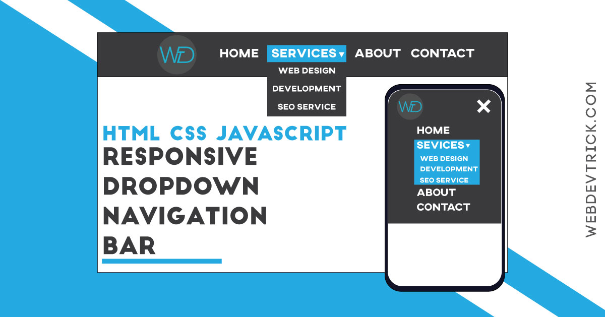
How to create a responsive navigation bar with the dropdown feature? Get the CSS Responsive Navbar With HTML & JavaScript, Dropdown Menu with logo.
As you know the menu bar or navbar is important for any kind website. Actually, the menu bar provides info about websites, which users need. There are various kinds of the navigation bar, 50% of websites style depends on their menu’s style. So, If you want to create an attractive and good looking site, then first you have to create a stylish menu.
Yesterday my one visitor ( Tarun ) ask me to create a responsive dropdown navigation bar with logo. That’s why today I am sharing CSS Responsive Navbar With HTML & JavaScript, Dropdown Menu or Navigation. This is a simple navigation bar, not a fancy one. This is pure CSS based responsive design, But I also used jQuery to create the mobile version’s toggle button.
jQuery is a javascript library, that’s why I am putting this program in JavaScript category. I did not use any CSS library to create it responsive. This program will be very helpful if you planning to create a website. A beginner also can understand the codes easily. It has very less JS code because I used js only to create a toggle button for mobile menu.
If you don’t understand what is the program responsive navigation bar, I am talking about. Then see this preview given here below.
Preview Of Dropdown Menu
See this video preview to getting an idea of how this program looks like.
Now you can see this program with web & mobile version. If you like this the get the source code of its.
You May Also Like:
- Image Split Into Parts Using HTML CSS JavaScript
- Animated CSS Text Mask
- Pure CSS Cards With Hover Effect
- Animated Search Box Design
CSS Responsive Navbar Source Code
Before sharing source code, let’s talk about the program. To creating this CSS Responsive Navar, I had used HTML, CSS, & JavaScript ( jQuery ). It has responsive design in pure CSS. As you know, I used jQuery only to create toggle for the mobile version. I used CSS @media ( get info )property to create it responsive. & I also used a google font to create it more beautiful. This program is <ul> and <li> based design, that’s why we can create dropdown easily. Basically, you can call this HTML CSS JavaScript Navigation Bar with responsive design.
For creating this program you have to create 3 files. First for HTML, second for CSS, and third for JavaScript. Follow the steps to creating this program without any error.
index.html
Create an HTML file named ‘index.html‘ and put these codes.
|
1 2 3 4 5 6 7 8 9 10 11 12 13 14 15 16 17 18 19 20 21 22 23 24 25 26 27 28 29 30 31 32 33 34 35 36 37 38 39 40 41 42 43 44 45 46 47 48 49 50 51 52 53 54 55 56 57 58 59 60 61 62 63 64 65 66 67 68 69 70 71 |
<!DOCTYPE html> <!-- code by webdevtrick ( https://webdevtrick.com ) --> <html> <head> <meta charset="UTF-8"> <title>Responsive Dropdown nav-bar Bar</title> <link href="https://fonts.googleapis.com/css?family=Righteous&display=swap" rel="stylesheet"> <link rel="stylesheet" href="style.css"> </head> <body> <section class="nav-bar"> <div class="nav-container"> <div class="brand"> <a href="https://webdevtrick.com/"><img src="https://webdevtrick.com/wp-content/uploads/logo-fb-1.png"></a> </div> <nav> <div class="nav-mobile"><a id="nav-toggle" href="#!"><span></span></a></div> <ul class="nav-list"> <li> <a href="#">Home</a> </li> <li> <a href="#">Web Design</a> </li> <li> <a href="#">Web Development</a> <ul class="nav-dropdown"> <li> <a href="#">HTML</a> </li> <li> <a href="#">CSS</a> </li> <li> <a href="#">JavaScript</a> </li> </ul> </li> <li> <a href="#!">Graphic Design</a> <ul class="nav-dropdown"> <li> <a href="#">Photoshop</a> </li> <li> <a href="#">Illustrator</a> </li> <li> <a href="#">InDesign</a> </li> </ul> </li> <li> <a href="#!">SEO</a> </li> <li> <a href="#">About</a> </li> </ul> </nav> </div> </section> <script src="http://cdnjs.cloudflare.com/ajax/libs/jquery/2.1.3/jquery.min.js"></script> <script src="function.js"></script> </body> </html> |
style.css
Now create a CSS file named ‘style.css‘ and put these codes.
|
1 2 3 4 5 6 7 8 9 10 11 12 13 14 15 16 17 18 19 20 21 22 23 24 25 26 27 28 29 30 31 32 33 34 35 36 37 38 39 40 41 42 43 44 45 46 47 48 49 50 51 52 53 54 55 56 57 58 59 60 61 62 63 64 65 66 67 68 69 70 71 72 73 74 75 76 77 78 79 80 81 82 83 84 85 86 87 88 89 90 91 92 93 94 95 96 97 98 99 100 101 102 103 104 105 106 107 108 109 110 111 112 113 114 115 116 117 118 119 120 121 122 123 124 125 126 127 128 129 130 131 132 133 134 135 136 137 138 139 140 141 142 143 144 145 146 147 148 149 150 151 152 153 154 155 156 157 158 159 160 161 162 163 164 165 166 167 168 169 170 171 172 |
/** code by webdevtrick ( https://webdevtrick.com ) **/ body { margin: 0; padding: 0; } * { font-family: 'Righteous', cursive; } .nav-bar { height: 70px; background: #262626; } .brand { position: absolute; padding-left: 20px; float: left; line-height: 70px; text-transform: uppercase; font-size: 1.4em; } .brand a img { max-height: 70px; } .brand a, .brand a:visited { color: #ffffff; text-decoration: none; } .nav-container { max-width: 1000px; margin: 0 auto; } nav { float: right; } nav ul { list-style: none; margin: 0; padding: 0; } nav ul li { float: left; position: relative; } nav ul li a, nav ul li a:visited { display: block; padding: 0 20px; line-height: 70px; background: #262626; color: #ffffff; text-decoration: none; } nav ul li a:hover, nav ul li a:visited:hover { background: #2ab1ce; color: #ffffff; } nav ul li a:not(:only-child):after, nav ul li a:visited:not(:only-child):after { padding-left: 4px; content: ' ▾'; } nav ul li ul li { min-width: 190px; } nav ul li ul li a { padding: 15px; line-height: 20px; } .nav-dropdown { position: absolute; display: none; z-index: 1; box-shadow: 0 3px 12px rgba(0, 0, 0, 0.15); } .nav-mobile { display: none; position: absolute; top: 0; right: 0; background: #262626; height: 70px; width: 70px; } @media only screen and (max-width: 798px) { .nav-mobile { display: block; } nav { width: 100%; padding: 70px 0 15px; } nav ul { display: none; } nav ul li { float: none; } nav ul li a { padding: 15px; line-height: 20px; padding-left: 25%; } nav ul li ul li a { padding-left: 30%; } .nav-dropdown { position: static; } .brand a img { max-height: 60px; margin-top: 5px; } } @media screen and (min-width: 799px) { .nav-list { display: block !important; } } #nav-toggle { position: absolute; left: 18px; top: 22px; cursor: pointer; padding: 10px 35px 16px 0px; } #nav-toggle span, #nav-toggle span:before, #nav-toggle span:after { cursor: pointer; border-radius: 1px; height: 5px; width: 35px; background: #ffffff; position: absolute; display: block; content: ''; transition: all 300ms ease-in-out; } #nav-toggle span:before { top: -10px; } #nav-toggle span:after { bottom: -10px; } #nav-toggle.active span { background-color: transparent; } #nav-toggle.active span:before, #nav-toggle.active span:after { top: 0; } #nav-toggle.active span:before { transform: rotate(45deg); } #nav-toggle.active span:after { transform: rotate(-45deg); } article { max-width: 1000px; margin: 0 auto; padding: 10px; } |
function.js
The final thing, create a JS file named ‘function.js‘ and put the codes given here.
|
1 2 3 4 5 6 7 8 9 10 11 12 13 14 15 16 17 18 19 |
/** code by webdevtrick ( https://webdevtrick.com ) **/ (function($) { $(function() { $('nav ul li a:not(:only-child)').click(function(e) { $(this).siblings('.nav-dropdown').toggle(); $('.dropdown').not($(this).siblings()).hide(); e.stopPropagation(); }); $('html').click(function() { $('.nav-dropdown').hide(); }); $('#nav-toggle').click(function() { $('nav ul').slideToggle(); }); $('#nav-toggle').on('click', function() { this.classList.toggle('active'); }); }); })(jQuery); |
That’s It. Now you have successfully created a CSS Responsive Navbar with the dropdown feature. If you have any doubt or question comment down below.
Thank For Visiting, Keep Visiting.


Thanks very much shaan for this navbar…..
Pleasure
How can a webpage view convet to mobile with excact alignment
Thanks for sharing this cool navbar..
Thank you very much, stay connected.
Thanx shaan this was helpful….
Thankyou
Thanks for your comment, stay connected.
Thanks 🙏 it not easy 🙏🙏🙏
Thank you very much, stay connected.
Hey that’s a really nice bar but the content above is not pushed with the bar :c. How can i resolve this ? Thank you 🙏
Hi Shaan,
Thanks for this, how do I make it so that it’s rollover instead of click on the non mobile size of the menu? I changed the function to hover on anywhere that says click on the function script but then the dropdown dissapears as soon as you roll over it.
Thanks
Cool keep it up
First of all thanks for the code, but there is an issue at the moment with this: when opening the second dropdown consecutively the 1st drop down does not close! Anyone else is having this issue?
Thanks!
This can be fixed by updating line 6 of the function.js file from
Before:
$(‘.dropdown’).not($(this).siblings()).hide();
After
$(‘.nav-dropdown’).not($(this).siblings()).hide();
perfectly work
Shaan, thank you! The menu is wonderful!
I would like to add “Open Menu” next to the hamburger and “Close Menu” next to the “X”, where do I put it?
Also, where can I resize the hamburger and the “X”?
Thank you in advance for your help! It is appreciated!
Hi Shaan, Thanks a lot for sharing it. Is there any way to instead of clicking on the dropdown menu to just mouse-over?
Thanks in advance!
Thanks a lot!
Could use some parts of your code to solve my problem, continue creating awesome stuff:)
Regards
Marvin
i put index.html style.css and function.js in on folder but it is not working is there any video reference
Really nice work
But the dropdown is not working on edje browser
thanks a lot,it really beneficial
I love this. Thanks for sharing 🙂
Every weekend i used to go to see this web site, as i wish for enjoyment, as this this website conations actually good funny stuff
too.
First of all thanks for the code, but there is an issue at the moment with this: when opening the second dropdown consecutively the 1st drop down does not close! Anyone else is having this issue? Before:
$(‘.dropdown’).not($(this).siblings()).hide();
After
$(‘.nav-dropdown’).not($(this).siblings()).hide();
but does not work and also in mobile does show mobile version please help me
i cant get any of the dropdowns to work I NEED HELP
can you explain the code please ?
I am new to Js and Jquery but today is a last day to submit the project.