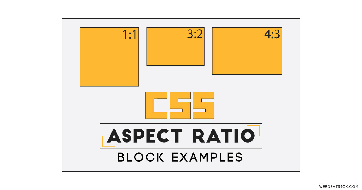
How we can maintain the aspect ratio of any element using CSS? Solution: Check Out This CSS Aspect Ratio Maintain Example. In other words, Flexible Block Units.
Basically, The aspect ratio of an element describes the proportional relationship between its width and height. It commonly looks like two numbers which are separated by a colon, like 16:9, 4:3, etc. In CSS we can create any flexible element with keeping their aspect ratio.
Today you will learn to create flexible block or elements using CSS aspect ratio. It is very important while we designing a responsive website, without this, we can’t create a proper responsive image, video, etc elements. If we will not use this flexible property, then we can’t place our elements in the same ratio on small screens.
So, Today I am sharing CSS Aspect Ration Maintain Example. Basically, I am sharing the method of how you can create responsive flex elements with keeping the width and height ratio. I have created 4 different ratio values elements using pure CSS. This is an example of a Pure CSS aspect ratio, there is no JavaScript.
If you are thinking now how these flexible boxes actually are, then see the preview given below.
Preview Of Flexible Box Units
See this video preview to getting an idea of how these box with aspect ratio looks like.
Now you can see the changes visually. If you like this and want to test yourself, then get the source code of its.
You May Also Like:
- CSS Clip Path Animation
- Responsive Full-Width Text
- Placeholder as Input Label
- Multi-Step Form With Progress Bar
CSS Aspect Ratio Maintain Example Source Code
Before sharing source code, let’s talk about it. The first thing is how we can maintain the aspect ratio? Yes, we can keep the original width & height ratio using CSS padding-top values. We can create different aspect ratios using different padding percentage values. Check out the padding-top percentage for different kinds of ratio.
| aspect ratio | padding-top value |
| 1:1 | 100% |
| 4:3 | 75% |
| 3:2 | 66.66% |
| 8:5 | 62.5% |
| 16:9 | 56.25% |
| 2:1 | 50% |
These are the padding percentage values in CSS, now you can create multiple ratio elements using these padding values.
For creating this program, I have used HTML <section> to create the whole layout. After that, I have added divs for each box & also put another div for text inside the box divs. Now in CSS file, I have put the width value for boxes is 45%. Now for maintaining the aspect ratio, I have used padding-top values as you can see above.
There are some other basic CSS properties, you will understand easily after getting the codes. For creating this flexible design you have to create only 2 files. One for the HTML, and second for CSS. Follow the steps to creating this without any error.
index.html
Create an HTML file named ‘index.html‘ and put these codes given here below.
|
1 2 3 4 5 6 7 8 9 10 11 12 13 14 15 16 17 18 19 20 21 22 23 24 25 26 27 28 29 30 |
<!DOCTYPE html> <!--Code By Webdevtrick ( https://webdevtrick.com )--> <html lang="en" > <head> <meta charset="UTF-8"> <title>CS Aspect Ratio | Webdevtrick.com</title> <link href="https://fonts.googleapis.com/css?family=Varela+Round&display=swap" rel="stylesheet"> <link rel="stylesheet" href="style.css"> </head> <body> <section class="ratio"> <h1>CSS Aspect Ratio</h1> <p>Resize the window to test</p> <div class="box ratio2-1"> <div class="text">Aspect ratio 2:1</div> </div> <div class="box ratio16-9"> <div class="text">Aspect ratio 16:9</div> </div> <div class="box ratio4-3"> <div class="text">Aspect ratio 4:3</div> </div> <div class="box ratio1-1"> <div class="text">Aspect ratio 1:1</div> </div> </section> </body> </html> |
style.css
Now create a CSS file named ‘style.css‘ and put these codes.
|
1 2 3 4 5 6 7 8 9 10 11 12 13 14 15 16 17 18 19 20 21 22 23 24 25 26 27 28 29 30 31 32 33 34 35 36 37 38 39 40 41 42 43 44 45 46 47 48 49 50 |
/* Code By Webdevtrick ( https://webdevtrick.com ) */ * { margin: 0; padding: 0; border: 0 none; position: relative; } html, body { background: #2ab1ce; font-family: Dosis; font-size: 1.1rem; line-height: 1.6; color: #FFF; font-family: 'Varela Round', sans-serif; } body {padding: 1rem;} .ratio { text-align: center; } .text { position: absolute; top: 0; left: 0; bottom: 0; right: 0; font-size: 1.5rem; color: #444; } .box { width: 45%; background: #fbb016; position: relative; display: inline-block; margin: 1%; vertical-align: top; box-shadow: 0 0 4px rgba(0,0,0,.3); } .box:before { content: ''; display: block; } .ratio1-1:before { padding-top: 100%; } .ratio2-1:before { padding-top: 50%; } .ratio4-3:before { padding-top: 75%; } .ratio16-9:before { padding-top: 56.25%; } |
That’s It. Now you have successfully created CSS Aspect Ratio Maintain Example with Flexible Box Units. If you have any doubt or question comment down below.
Thanks For Visiting, Keep Visiting.

