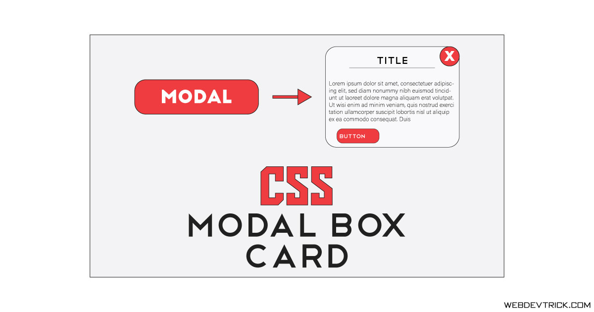
How we can create a popup card on button click using pure HTML and CSS? Solution: See this Pure CSS Modal Box Card With HTML, Popup Modal Card.
Previously I have shared a modal box with CSS and jquery, But this is with pure CSS. Basically, the modal box is a kind of popup or dialog type box which appears on click or other action. That kind of popup box is very important while we are designing a website or web application.
Today you will learn to create popup cards with the help of modal box. Basically, there is a button when you click on that, then a popup card appears. I think this will be useful for you on your website or any project. You can use this as a dialog box for showing short information or telling about something else.
So, Today I am sharing Pure CSS Modal Box Card With HTML. This modal box completely builds with pure CSS, even the open/close feature is without JavaScript. This modal box has a close button and good gradient background UI, you can customize according to your choice. You also can put a link or any action in the button.
If you are thinking now how this modal box card actually is, then see the preview given below.
Preview Of Popup Modal Card
See this video preview to getting an idea of how this design looks like.
Now you can see this visually, Also you can see it live by pressing the button above. If you like this, then get the source code of its.
You May Also Like:
Pure CSS Modal Box Card With HTML Source Code
Before sharing source code, let’s talk about it. First I have created a button to open the modal box, and put its id="model-closed" . Now I have created the modal box and its contents with id="modal-opened" , and also created a link for the close button. The whole concept is based on id and link targeting (info).
After that, I have placed ‘model-opened ‘ target on the first button, and ‘model-closed’ target on the close button. Now using CSS I have placed all the elements on right places and gave many values like color, position, transition, transform, etc. For creating the close buttons I have used x value in CSS content command.
That is the whole concept, left all other things you will understand after getting the codes I can’t explain all in writing. For creating this modal card you have to create only 2 files, one for HTML and one for CSS. Follow the steps to creating this without any error.
index.html
Create an HTML file named ‘index.html‘ and put these codes given here below.
|
1 2 3 4 5 6 7 8 9 10 11 12 13 14 15 16 17 18 19 20 21 22 23 24 25 26 27 28 29 30 31 32 33 |
<!DOCTYPE html> <!--Code By Webdevtrick ( https://webdevtrick.com )--> <html lang="en" > <head> <meta charset="UTF-8"> <title>Pure CSS Modal Card | Webdevtrick.com</title> <meta name="viewport" content="width=device-width, initial-scale=1.0"> <meta http-equiv="X-UA-Compatible" content="ie=edge"> <link rel="stylesheet" href="style.css"> </head> <body> <a href="#modal-opened" class="link-1" id="modal-closed">Open Modal</a> <div class="container" id="modal-opened"> <div class="modal"> <div class="details"> <h1 class="title">Your Title</h1> <p class="description">Slogan will be here at this place.</p> </div> <p class="txt">Lorem ipsum dolor sit amet, consectetur adipisicing elit. Facilis ex dicta maiores libero minus obcaecati iste optio, eius labore repellendus.</p> <button class="btn">Button →</button> <a href="#modal-closed" class="link-2"></a> </div> </div> </body> </html> |
style.css
Now create a CSS file named ‘style.css‘ and put these codes given here.
|
1 2 3 4 5 6 7 8 9 10 11 12 13 14 15 16 17 18 19 20 21 22 23 24 25 26 27 28 29 30 31 32 33 34 35 36 37 38 39 40 41 42 43 44 45 46 47 48 49 50 51 52 53 54 55 56 57 58 59 60 61 62 63 64 65 66 67 68 69 70 71 72 73 74 75 76 77 78 79 80 81 82 83 84 85 86 87 88 89 90 91 92 93 94 95 96 97 98 99 100 101 102 103 104 105 106 107 108 109 110 111 112 113 114 115 116 117 118 119 120 121 122 123 124 125 126 127 128 129 130 131 132 133 134 135 136 137 138 139 140 |
*, *::after, *::before { margin: 0; padding: 0; box-sizing: border-box; } html { font-size: 62.5%; } body { display: flex; flex-direction: column; justify-content: center; align-items: center; font-family: -apple-system, BlinkMacSystemFont, 'Segoe UI', 'Open Sans', sans-serif; min-height: 100vh; } a, a:link { font-family: inherit; text-decoration: none; } .container { position: fixed; top: 0; left: 0; z-index: 10; display: none; justify-content: center; align-items: center; width: 100%; height: 100%; } .container:target { display: flex; } .modal { width: 60rem; padding: 4rem 2rem; border-radius: .8rem; color: hsl(0, 0%, 100%); background: linear-gradient(to right bottom, #009FFF, #ec2F4B); box-shadow: .4rem .4rem 2.4rem .2rem hsla(236, 50%, 50%, 0.3); position: relative; overflow: hidden; } .details { text-align: center; margin-bottom: 4rem; padding-bottom: 4rem; border-bottom: 1px solid hsla(0, 0%, 100%, .4); } .title { font-size: 3.2rem; } .description { margin-top: 2rem; font-size: 1.6rem; font-style: italic; } .txt { padding: 0 4rem; margin-bottom: 4rem; font-size: 1.6rem; line-height: 2; } .txt::before { content: ''; position: absolute; top: 0%; left: 100%; -webkit-transform: translate(-50%, -50%); transform: translate(-50%, -50%); width: 18rem; height: 18rem; border: 1px solid hsla(0, 0%, 100%, .2); border-radius: 100rem; pointer-events: none; } .btn { padding: 1rem 1.6rem; border: 1px solid hsla(0, 0%, 100%, .4); border-radius: 100rem; color: inherit; background: transparent; font-size: 1.4rem; font-family: inherit; letter-spacing: .2rem; transition: .2s; cursor: pointer; } .btn:hover, .btn:focus { border-color: hsla(0, 0%, 100%, .6); -webkit-transform: translateY(-.2rem); transform: translateY(-.2rem); } .link-1 { font-size: 1.8rem; color: hsl(0, 0%, 100%); background: linear-gradient(to right bottom, #009FFF, #ec2F4B); box-shadow: .4rem .4rem 2.4rem .2rem hsla(236, 50%, 50%, 0.3); border-radius: 100rem; padding: 1.4rem 3.2rem; transition: .2s; } .link-1:hover, .link-1:focus { -webkit-transform: translateY(-.2rem); transform: translateY(-.2rem); box-shadow: 0 0 4.4rem .2rem hsla(236, 50%, 50%, 0.4); } .link-2 { width: 4rem; height: 4rem; border: 1px solid hsla(0, 0%, 100%, .4); border-radius: 100rem; color: inherit; font-size: 2.2rem; position: absolute; top: 2rem; right: 2rem; display: flex; justify-content: center; align-items: center; transition: .2s; } .link-2::before { content: '×'; -webkit-transform: translateY(-.1rem); transform: translateY(-.1rem); } .link-2:hover, .link-2:focus { border-color: hsla(0, 0%, 100%, .6); -webkit-transform: translateY(-.2rem); transform: translateY(-.2rem); } |
That’s It. Now you have successfully created Pure CSS Modal Box Card With HTML, Popup Modal Card. If you have any doubt or question comment down below.
Thanks For Visiting, Keep Visiting.



Which piece of code is responsible for showing and hiding the modal?
How can I get the modal to open as a notification as soon as the page loads instead of needing to click a button?