How we can create a responsive grid layout for images using pure CSS. Solution: CSS Masonry Image Gird Layout, Responsive Grid Column.
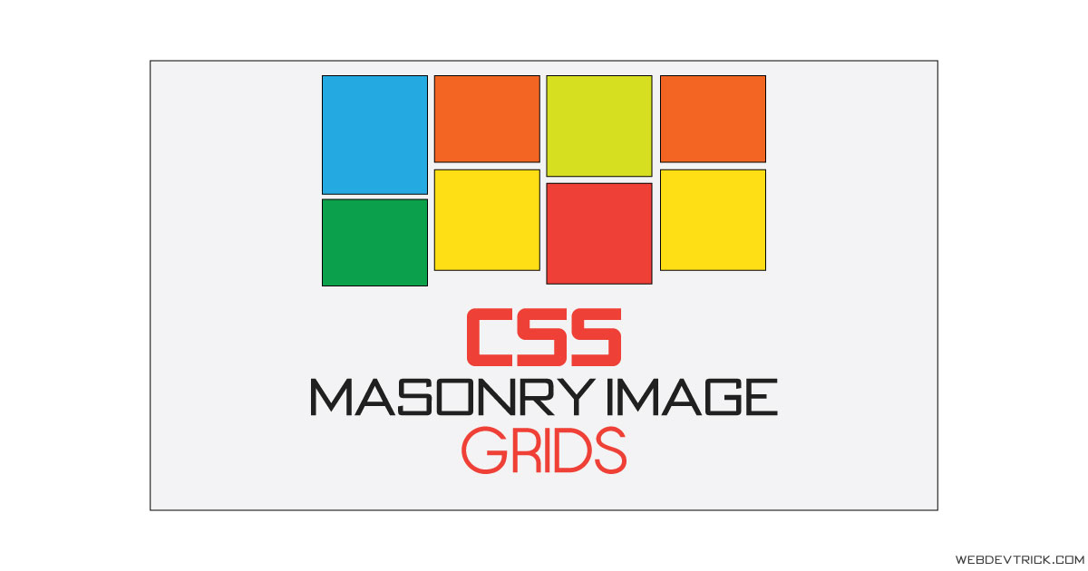
Previously I have shared a Grid Menu Layout, but this time is for image gird. Basically, masonry stands for placing elements in optimal position based on available vertical space, like a mason fitting stones in a wall. Nowadays many image sharing websites use this type of layout. For example, you can see Pinterest.
Today you will learn to create responsive image grid columns. This is very easy stuff, whole design majorly based on 2-3 properties. One of my visitors asks me for creating this, that’s why posting this. You can use this on your website in the portfolio section, or any other place as you want.
So, Today I am sharing CSS Masonry Image Gird Layout. This is a pure CSS design, I have not used JS and there are very fewer lines of CSS code. The design is not based on flexbox, I have used the column layout. If you are a beginner then you can also understand this very easily.
If you are thinking now how the image grid actually is, then see the preview given below.
Preview Of Responsive Grid Column
See this video preview to getting an idea of how this grid looks like.
Live DemoNow you can see this visually, also you can see it live by pressing the button given above. If you like this, then get the source code of its.
You May Also Like:
- CSS Border Transition Effects
- Sidebar Menu With Flexbox
- Responsive Full Width Text
- Modal Box With Overlay
CSS Masonry Image Gird Layout Source Code
Before sharing source code, let’s talk about it. First I have created a divs with two class names container, and column. The container class is to giving width and placing the whole divs, and the column class is for managing image grids. Inside the div, I have placed some random images using Lorem Picsum.
Now in the CSS file, I gave max-width for the whole container. I have used CSS column-* property for creating grid. The CSS multi-column layout allows creating column grids.I have used three column properties column-count , column-gapand column-width . Left all other basic things you will understand after getting the codes.
For creating this layout you have to create just 2 files, one for HTML and one for CSS. Follow the steps to creating this without any error.
index.html
Create an HTML file named ‘index.html‘ and put these codes given here below.
|
1 2 3 4 5 6 7 8 9 10 11 12 13 14 15 16 17 18 19 20 21 22 23 24 25 26 27 |
<!DOCTYPE html> <!--Code By Webdevtrick ( https://webdevtrick.com )--> <html lang="en" > <head> <meta charset="UTF-8"> <title>Layout fluide type Masonry en CSS</title> <link rel="stylesheet" href="https://cdnjs.cloudflare.com/ajax/libs/normalize/5.0.0/normalize.min.css"> <link rel="stylesheet" href="style.css"> </head> <body> <div class="container columns"> <img src="https://picsum.photos/id/10/640/480" alt="Lorem Picsum"> <img src="https://picsum.photos/id/100/512/720" alt="Lorem Picsum"> <img src="https://picsum.photos/id/1002/350" alt="Lorem Picsum"> <img src="https://picsum.photos/id/1018/340/550" alt="Lorem Picsum"> <img src="https://picsum.photos/id/1058/420/640" alt="Lorem Picsum"> <img src="https://picsum.photos/id/1069/350" alt="Lorem Picsum"> <img src="https://picsum.photos/id/1080/512/720" alt="Lorem Picsum"> <img src="https://picsum.photos/id/348/512" alt="Lorem Picsum"> <img src="https://picsum.photos/id/447/600" alt="Lorem Picsum"> <img src="https://picsum.photos/id/515/350/350" alt="Lorem Picsum"> <img src="https://picsum.photos/id/64/420/640" alt="Lorem Picsum"> <img src="https://picsum.photos/id/799/440/600" alt="Lorem Picsum"> </div> </body> </html> |
style.css
Now create a CSS file named ‘style.css‘ and put the codes given here.
|
1 2 3 4 5 6 7 8 9 10 11 12 13 14 15 16 17 18 19 20 21 22 23 24 25 26 27 28 29 30 31 32 33 34 35 36 37 38 39 40 41 42 43 44 45 |
/** Code By Webdevtrick ( https://webdevtrick.com ) **/ body { background-color: #e0e0e0; } .container { margin: 0 auto; max-width: 960px; padding: 20px; } .columns { -webkit-column-count: 3; -moz-column-count: 3; column-count: 3; -webkit-column-gap: 20px; -moz-column-gap: 20px; column-gap: 20px; -webkit-column-width: 33.33333333333333%; -moz-column-width: 33.33333333333333%; column-width: 33.33333333333333%; } img { width: 100%; height: auto; margin-bottom: 15px; } @media only screen and (min-width: 480px) and (max-width: 727px) { .columns { -webkit-column-count: 2; -moz-column-count: 2; column-count: 2; -webkit-column-width: 50%; -moz-column-width: 50%; column-width: 50%; } } @media only screen and (max-width: 479px) { .columns { -webkit-column-count: 1; -moz-column-count: 1; column-count: 1; -webkit-column-width: 100%; -moz-column-width: 100%; column-width: 100%; } } |
That’s It. Now you have successfully created CSS Masonry Image Gird Layout, Responsive Grid Column. If you have any doubt or question comment down below.
Thanks For Visiting, Keep Visiting.



Thankz boss
Your tutorial are amazing but copy paste won’t work you can explain the code too
sure, next time.
Amazng Tutorial Bro
Thanks
-webkit-column-count: 3;
-moz-column-count: 3;
column-count: 3;
not supported on ipad or ios