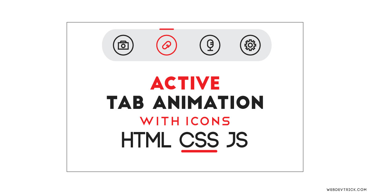
How we can create an active tab slider with icons using HTML, CSS, & JS? Solution: CSS Active Tab Animation With Icons, Animated Active Tab Slider Indicator.
I am sure that you know what is HTML tab, Previously I have shared Pure CSS tab you can check that. This is an animated design of tab, I did not put any matter in the tabs all are blank. Basically, Tabs are perfect for single-page web applications, or for displaying different subjects in less area.
Today you will learn to create an Animated Active Tab Slider with Indicator. When you will click on any tab A line will indicate the currently active tab with a little animation. These all are blank tabs you can put the matters according to your requirement. I think this post will be very useful to learn and improve your HTML, CSS, & JS Skills.
So, Today I am sharing CSS Active Tab Animation With Icons. With HTML & CSS I have used jQuery for creating the active tab slider indicator. This tab looks like an app’s bottom navbar because of its UI. jQuery is JavaScript library & that’s why I am putting this on JS category. You can say this a Tabs and Active Page Highlight combination because I have used features of these together.
If you are thinking now how this active tab slider actually is, Then see the preview given below.
Preview Of Active Tabs Slider Highlight
See this video preview to getting an idea of how this tab design looks like.
Now you can see this visually. If you like this, then get the source code of its.
You May Also Like:
- Responsive Full Width Text
- CSS Breadcrumb Design
- Multi Step Form With Progress Bar
- Animated Scroll Images Infinity
CSS Active Tab Animation With Icons Source Code
Before sharing source code, let’s talk about it. I have created this tab using HTML lists <ul> and <li> and also put a span on each li for icon. All the icons are from inearicons, I have used this because of minimal icons. In the CSS file, I have placed all the elements in the right place.
As you can see on the preview there is an indicator of the active tab. For the active class, I have used icons color red and put a line on top also with red color. Now the jQuery work as remove active class for the previous tab and shift into the currently active tab. Basically, jQuery put the active class on the tab which you have clicked currently.
The line shift with an animation effect, for this I used CSS @keyframes for creating this. First I put line’s width .6rem then 3rem now the actual size. The whole keyframe looks like this: @keyframes moveActive { 0% {width:.6rem;} 20%{width: 3rem;}100% {width: 1.5rem;} } .
There are left many basic commands, I can’t explain all in writing. You will understand easily after getting the codes. for creating this animated tab program you have to create 3 files. First for HTML, second for CSS, & third for JavaScript. Follow the steps to creating this without any error.
index.html
Create an HTML file named ‘index.html‘ and put these codes given here below.
|
1 2 3 4 5 6 7 8 9 10 11 12 13 14 15 16 17 18 19 20 21 22 23 24 25 26 27 28 29 30 31 32 33 34 35 36 37 38 39 40 41 42 |
<!DOCTYPE html> <!-- Code By Webdedtrick ( https://webdevtrick.com ) --> <html lang="en" > <head> <meta charset="UTF-8"> <title>CSS Active Tab Animation | Webdedtrick.com</title> <link rel='stylesheet' href='https://cdn.linearicons.com/free/1.0.0/icon-font.min.css'> <link rel="stylesheet" href="style.css"> </head> <body> <nav class="container"> <div class="wrap"> <ul class="nav-grid" id="list"> <li class="nav-grid-items text-center active"> <span class="lnr lnr-home icon"></span> </li> <li class="nav-grid-items text-center"> <span class="lnr lnr-sun icon"></span> </li> <li class="nav-grid-items text-center"> <span class="lnr lnr-bubble icon"></span> </li> <li class="nav-grid-items text-center"> <span class="lnr lnr-heart icon"></span> </li> <li class="nav-grid-items text-center"> <span class="lnr lnr-user icon"></span> </li> <li class="active-grid-circle"> <div id="active-nav-grid-item" class="nav-circle grid-item-active"> </div> </li> </ul> </div> </nav> <script src='https://cdnjs.cloudflare.com/ajax/libs/jquery/3.3.1/jquery.min.js'></script> <script src="function.js"></script> </body> </html> |
style.css
Now create a CSS file named ‘style.css‘ and put these codes given below.
|
1 2 3 4 5 6 7 8 9 10 11 12 13 14 15 16 17 18 19 20 21 22 23 24 25 26 27 28 29 30 31 32 33 34 35 36 37 38 39 40 41 42 43 44 45 46 47 48 49 50 51 52 53 54 55 56 57 58 59 60 61 62 63 64 65 66 67 68 69 70 71 72 73 74 75 76 77 78 79 80 81 82 83 84 85 86 87 88 89 90 91 92 93 94 95 96 97 98 99 100 101 102 103 104 105 |
/** Code By Webdedtrick ( https://webdevtrick.com ) **/ body { background: #ebebeb; } .container { position: fixed; margin: auto; top: 400px; left: 0; width: 100%; z-index: 999; } .wrap { width: 550px; margin: 16px auto; background: #FDFFFC; border-radius: 1rem; box-shadow: 0 2px 1px -1px rgba(0, 0, 0, .2), 0 1px 1px 0 rgba(0, 0, 0, .14), 0 1px 3px 0 rgba(0, 0, 0, .12); } .wrap .active-grid-circle { display: grid; width: 100%; } .wrap .nav-circle { width: 1.5rem; height: .6rem; border-radius: 100px; background: #f24c5e; position: relative; margin-bottom: -4.2rem; margin-left: auto; margin-right: auto; margin-top: auto; bottom: 8.6rem; left: 0%; display: none; justify-content: center; align-items: center; transition: 0.355s cubic-bezier(0.46, 0.03, 0.52, 0.96); } .nav-grid { width: 100%; padding: 0; margin: 0; display: grid; grid-template-columns: 1fr 1fr 1fr 1fr 1fr; } .nav-grid .nav-grid-items { padding: 16px 10px; display: flex; align-items: center; justify-content: center; cursor: pointer; } .nav-grid .nav-grid-items .icon { color: #212121; font-size: 2.8rem; } .nav-grid .nav-grid-items.active .icon { color: #f24c5e; } .grid-item-active { display: flex !important; align-items: center; justify-content: center; -webkit-animation: zoomIn .255s cubic-bezier(0.46, 0.03, 0.21, 0.93); animation: zoomIn .255s cubic-bezier(0.46, 0.03, 0.21, 0.93); } .container.theme-dark .wrap { background: #212121; } .container.theme-dark .nav-grid .nav-grid-items .icon { color: #eee; } .container.theme-dark .nav-grid .nav-grid-items.active .icon { color: #f24c5e; } @keyframes zoomIn { from { opacity: 0; -webkit-transform: scale3d(0.3, 0.3, 0.3); transform: scale3d(0.3, 0.3, 0.3); } 50% { opacity: 1; } } .zoomIn { -webkit-animation-name: zoomIn; animation-name: zoomIn; } @keyframes moveActive { 0% { width: .6rem; } 20% { width: 3rem; } 100% { width: 1.5rem; } } |
function.js
The final step, Create a JS file for jQuery named ‘function.js‘ and put the codes.
|
1 2 3 4 5 6 7 8 9 10 11 12 13 14 15 16 17 18 |
/** Code By Webdedtrick ( https://webdevtrick.com ) **/ $(document).ready(function () { $(".nav-grid-items").click(function () { $(".grid-item-active").css("animation", "moveActive .455s cubic-bezier(0.46, 0.03, 0.21, 0.93)"); var index = ($(this).index()); var positionChange = 100; var finalValue = positionChange * index.toString() + `%`; $('.nav-grid-items').removeClass('active'); $(this).addClass('active'); $("#active-nav-grid-item").css("left", finalValue); setTimeout(() => { $(".grid-item-active").css("animation", "reset"); }, 500); }); }); |
That’s It. Now you have successfully created CSS Active Tab Animation With Icons, Animated Active Tab Slider Highlight or Indicator. If you have any doubt or question comment down below.
Thanks For Visiting, Keep Visiting.



Would you be able to add pop up modal to each icon when clicked with text in the specific pop up box?