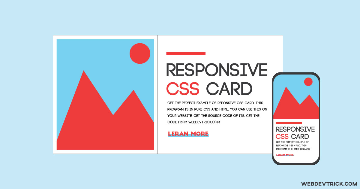
How we can create a responsive flexbox card using HTML & CSS? Solution: Responsive CSS Flexbox Design, Pure HTML CSS Flex Card.
Maybe you know or you have heard flexbox before. Basically, flex is a layout module comes with CSS3. In other words, a flexible layout called flexbox. & an area of a document laid out using flexbox is called a flex container.
Today I will show you how to create a responsive card using CSS flex. In other words, You will learn today how to create CSS flexbox with responsive design. So, today I am sharing Responsive CSS Flexbox design, a Pure HTML CSS Flex Card. I had created just one, but you can create the quantity as you want, after seeing this post.
Basically, This is a CSS flex property based card program and an example of how we can create responsive cards without bootstrap. And it’s also has a text underline animation when hovering on the link. So, it has with responsive design a hover animation also. This program is clean and easy to understand. A beginner can understand it quick & easily.
If you are thinking now, how this program actually is. Then see the preview given below.
Preview Of Pure HTML CSS Flex Card
See this video preview to getting an idea of how this program looks like.
Now you can see this program visually. If you like this then get the source code of its.
You May Also Like:
- CSS Custom Checkbox
- HTML CSS Day & Night Mode
- Responsive Animated Contact Form
- CSS Image Gallery With 3D Effect
Responsive CSS Flexbox Source Code
Before sharing source code, let’s talk about this program. As you know this is a CSS flex based card program, it has responsive design and link hover effect. In short, this is a CSS Flexbox card with link hover effect. I used CSS display: flex; (get info) property to creating this. Also used @media property for responsive design. You will fully understand the whole program after seeing the codes.
For creating this program you have to create only 2 files. One for HTML and one for CSS. Follow the steps to creating this without any error.
index.html
Create an HTML file named ‘index.html‘ and put these codes given here below.
|
1 2 3 4 5 6 7 8 9 10 11 12 13 14 15 16 17 18 19 20 21 22 23 24 25 |
<!DOCTYPE html> <!-- code by webdevtrick ( https://webdevtrick.com ) --> <html> <head> <meta charset="UTF-8"> <title>Responsive card design with link hover effect</title> <link href="https://fonts.googleapis.com/css?family=Questrial&display=swap" rel="stylesheet"> <link rel="stylesheet" href="style.css"> </head> <body> <div class="main"> <div class="container"> <div class="imag"></div> <div class="text-container"> <span></span> <h1>Web Development</h1> <p>Get the lastest and trending web development project's source code, first see preview if you need then get the code. </p> <a href="https://webdevtrick.com" target="_blank">Visit Webdevtrick</a> </div> </div> </div> </body> </html> |
style.css
Now create a CSS file named ‘style.css‘ and put these codes.
|
1 2 3 4 5 6 7 8 9 10 11 12 13 14 15 16 17 18 19 20 21 22 23 24 25 26 27 28 29 30 31 32 33 34 35 36 37 38 39 40 41 42 43 44 45 46 47 48 49 50 51 52 53 54 55 56 57 58 59 60 61 62 63 64 65 66 67 68 69 70 71 72 73 74 75 76 77 78 79 80 81 82 83 84 85 86 87 88 89 90 91 92 93 94 95 96 97 98 99 100 101 102 103 104 105 106 107 108 109 110 111 112 |
/** code by webdevtrick ( https://webdevtrick.com ) **/ * { transition: .33s ease all; box-sizing: border-box; } body { margin: 0; padding: 0; } html { font-family: 'Questrial', sans-serif; box-sizing: border-box; } span { display: inline-block; width: 50px; height: 5px; background-color: #FF3434; margin-bottom: 30px; } div.main { height: 100vh; display: flex; align-items: center; justify-content: center; background-color: #80EDFF; } div.container { background-color: white; display: flex; flex-direction: column; align-items: center; justify-content: center; margin: 30px; box-shadow: 0 8px 16px rgba(0, 0, 0, 0.45); } imag { width: 100%; } h1 { font-weight: 600; font-size: 36px; margin: 0 0 15px; } p { font-weight: 300; line-height: 24px; margin: 0 0 30px 0; } a { text-decoration: none; text-transform: uppercase; color: #FF3434; font-weight: bold; font-size: 14px; position: relative; display: inline-block; z-index: 1; padding: 5px; left: -5px; } a:hover { color: #FF3434; } a::before { content: ''; z-index: -1; position: absolute; top: calc(50%); left: 0; width: 100%; height: 40%; pointer-events: none; background: #80EDFF; transform: scale3d(0, 1, 1); transform-origin: 0% 50%; transition: transform 0.33s; } a:hover::before { transform: scale3d(1, 1, 1); transform-origin: 0% 50%; } div.imag { height: 300px; width: 100%; background: url("https://images.pexels.com/photos/546819/pexels-photo-546819.jpeg"); background-position: center; background-size: cover; } div.text-container { margin: 60px 45px 55px; } @media screen and (min-width: 768px) { div.container { flex-direction: row; width: 100%; } div.imag { height: 420px; min-width: 360px; } div.text-container { margin: 0 60px; max-width: 660px; } } @media screen and (min-width: 1024px) { div.container { max-width: 1200px; } } |
That’s It. Now you have successfully created a Responsive CSS Flexbox card, a Pure HTML CSS card. If you have any doubt or question comment down below.
Thanks For Visiting, Keep Visiting.



Hi can you told me what is your theme name? I think it is ionMag..Am i right??
Yes, bro. This is Ionmag.
Bro can you explain the CSS code… Because sharing the code isn’t enough… Explaining is also important…
Sure bro, Next time I will provide full info. For this post message me on facebook – Webdevtrick
Hello bro your content is awesome
Can you tell me how I can learn javascript from scratch and makecawesome project’s??
First, lean javascript well. Don’t switch to the library quickly.
I’m more annoyed at the misspelling of image then I rationally should be.
What??
I think he’s referring to the class named “imag” and it’s useage . . .
hehe, Sorry. I take a random class name quickly.
I thought it was just me!
Is there a reason you have “div.main” and “div.container” twice with the exact same code, in your CSS?
Sorry, I put mistakenly. Let me update.
Nice information about css html coding
Hi, You’ve done an excellent job. I’ll certainly digg it and
individually recommend to my twitter followers. I’m confident
they will be benefited
from this website.