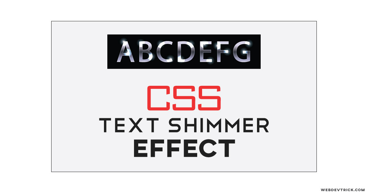
How we can create a shine and shimmer effect for text using HTML and CSS? Solution: See this Pure CSS Shimmer Text Effect With Loop Moving, Text Shine Effect.
Previously I have shared many types of text effects, But this is about shine and shimmer effect on the text. Maybe you have seen a shine effect move on text on some places. Many websites use this effect on their page’s heading or somewhere else. But this effect is pretty cool and use can be created using only CSS.
Today you will learn to create text shine effect with loop moving. Basically, there is a simple text and a shine effect which is created using a gradient, its move left to right infinite. The moving gradient creates the shimmer effect on text, with the same method we can apply the effect on other elements.
So, Today I am sharing Pure CSS Shimmer Text Effect With Loop Moving. This effect will useful for you if you are a web designer, also you can easily create this after knowing the gradient combination or you can create or own combination. Also, you can customize colors, direction, gradient points, etc.
If you are thinking now how this shimmer effect actually is, then see the preview given below.
Preview Of Text Shine Effect
See this video preview to getting an idea of how this effect looks like.
Live DemoNow you can see this visually, you also can see it live by pressing the button given above. If you like this, then get the source code of its.
You May Also Like:
- CSS Gradient Ghost Button
- Masonry Image Grid Layout
- Popup Subscription Form
- Floating Social Share Buttons
Pure CSS Shimmer Text Effect Source Code
Before sharing source code, let’s talk about it. First I have put a text line inside HTML heading one, you can place it with also paragraph or span tag. I the heading I have placed a class name, that is the main things you have put the class name and you can use any tag. I have used a google font named Lato for this text.
Now using CSS I have placed the text in middle using text-align: center; and put the font size and weight. Now put the text’s color very fade and light and created a linear gradient which stops in white color. And using CSS @keyframe I have created an animation which goes left to right and put animation count infinite.
Left all other things you will understand after getting the codes, I can’t explain all in writing. For creating this effect, you have to create only 2 files one for HTML and one for CSS. Follow the steps to creating this without any error.
index.html
Create an HTML file named ‘index.html‘ and put these codes given here below.
|
1 2 3 4 5 6 7 8 9 10 11 12 13 14 15 |
<!DOCTYPE html> <!--Code By Webdevtrick ( https://webdevtrick.com)--> <html lang="en" > <head> <meta charset="UTF-8"> <title>CSS Shimmer Text Effect | Webdevtrick.com</title> <link rel='stylesheet' href='https://fonts.googleapis.com/css?family=Lato:300'> <link rel="stylesheet" href="./style.css"> </head> <body> <h1 class="shimmer">CSS Shimmer Effect</h1> </body> </html> |
style.css
Now create a CSS file named ‘style.css‘ and put these codes given here.
|
1 2 3 4 5 6 7 8 9 10 11 12 13 14 15 16 17 18 19 20 21 22 23 24 25 26 27 28 29 30 31 32 33 34 35 36 37 38 39 40 41 42 43 44 45 46 47 48 49 50 51 52 53 54 55 56 57 58 59 60 61 62 63 64 65 66 67 68 69 70 71 72 73 |
/* Code By Webdevtrick ( https://webdevtrick.com) */ body { background: #000; text-align: center; margin-top: 20%; } .shimmer { font-family: "Lato"; font-weight: 300; font-size: 3em; margin: 0 auto; padding: 0 140px 0 0; display: inline; margin-bottom: 0; } .shimmer { text-align: center; color: rgba(255,255,255,0.1); background: -webkit-gradient(linear, left top, right top, from(#222), to(#222), color-stop(0.5, #fff)); background: -moz-gradient(linear, left top, right top, from(#222), to(#222), color-stop(0.5, #fff)); background: gradient(linear, left top, right top, from(#222), to(#222), color-stop(0.5, #fff)); -webkit-background-size: 125px 100%; -moz-background-size: 125px 100%; background-size: 125px 100%; -webkit-background-clip: text; -moz-background-clip: text; background-clip: text; -webkit-animation-name: shimmer; -moz-animation-name: shimmer; animation-name: shimmer; -webkit-animation-duration: 2s; -moz-animation-duration: 2s; animation-duration: 2s; -webkit-animation-iteration-count: infinite; -moz-animation-iteration-count: infinite; animation-iteration-count: infinite; background-repeat: no-repeat; background-position: 0 0; background-color: #222; } @-moz-keyframes shimmer { 0% { background-position: top left; } 100% { background-position: top right; } } @-webkit-keyframes shimmer { 0% { background-position: top left; } 100% { background-position: top right; } } @-o-keyframes shimmer { 0% { background-position: top left; } 100% { background-position: top right; } } @keyframes shimmer { 0% { background-position: top left; } 100% { background-position: top right; } } |
That’s It. Now you have successfully created Pure CSS Shimmer Text Effect With Loop Moving, Text Shine Effect. If you have any doubt or question comment down below.
Thanks For Visiting, Keep Visiting.

How can one get around the padding-right? This forces a border to go rogue. Can you shimmer a who word without having this obtrusive padding to the right?