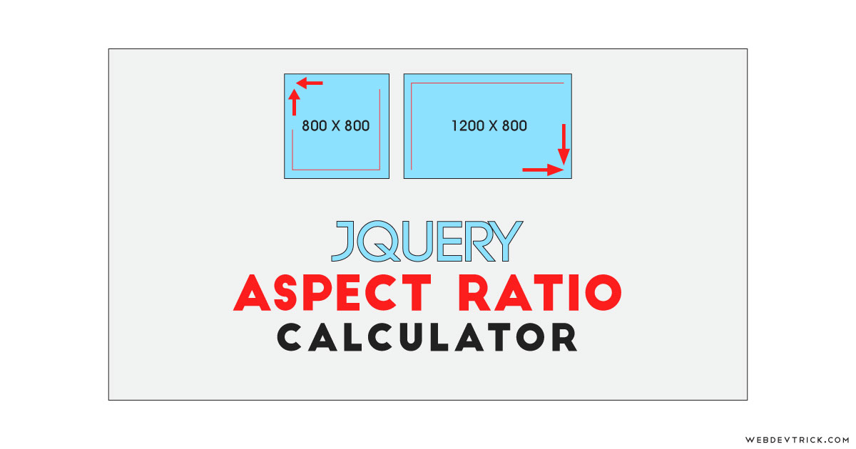
How we can calculate aspect ratio by creating a program using HTML CSS JS? Solution: See this jQuery Aspect Ratio Calculator With CSS UI, Calculate Aspect Ratio Program.
Previously I have shared aspect ratio maintains example using CSS, but this program is for calculating the ratio according to original size. Basically, The aspect ratio of an element describes the proportional relationship between its width and its height. And aspect ratio commonly expressed as two numbers separated by a colon, like 3:2, 16:8, etc.
Today you will learn to create a program for calculating aspect ratio. Basically there are two fields with 2 number inputs, which means there is total of 4 inputs and on first field for put original size and the second one is to get the ratio. In the original size field, there is a width-height combination already placed by default also you can change it. Now when you will put width on the second field, then the program will calculate height by maintaining aspect ratio. The same condition also applicable when you will put height to getting the width.
So, Today I am sharing jQuery Aspect Ratio Calculator With CSS UI or styling. There I have used jQuery for creating this program because it saves time and we have to less code. As we know jQuery is a JS library that’s why I am putting this in the JavaScript category. And CSS is for styling little bit the program to looks good.
If you are thinking now how this aspect ratio calculator actually is, then see the preview given below.
Preview Of Calculate Width-Height Ratio Program
See this video preview to getting an idea of how this ratio calculator program looks like.
Now you can see this visually, also you can see it live by pressing the button given above. If you like this then get the source code of its.
You May Also Like:
jQuery Aspect Ratio Calculator With CSS UI Source Code
Before sharing source code, talk a little bit about it. First I have created a main div named container and placed two divs inside it. These two divs are for creating the inputs for original and new width-height calculation. Inside these both two fields, I have placed two number inputs for put and get values. Also in the HTML file, I have linked other files like CSS, JS, and jQuery CDN link.
Now using CSS I have placed all the items in the right place, as you can see in the preview. With CSS, I gave the height, width, margin, padding, etc to all the programs. There I have used a google font for the heading style, and many more basic things I have done using CSS. For creating this program responsive, used max-width: and CSS @media query.
jQuery handling here the calculator feature of this program. There are some formulas for getting a new width and height by maintaining aspect ratio. The formula for getting new height is: “new width / (original width / original height)” and for new width is: “(original width / original height) * new height”. And for calculator according to these formulas I have used JS Math. commmand (info).
Left all other things you will understand after getting the codes, I can’t explain all in writing. For creating this program you have to create 3 files. First for HTML, second for CSS, and the third for JavaScript. Follow the steps to creating this program without any error.
index.html
Create an HTML file named ‘index.html‘ and put these codes given below.
|
1 2 3 4 5 6 7 8 9 10 11 12 13 14 15 16 17 18 19 20 21 22 23 24 25 26 27 28 29 30 31 32 33 34 35 36 37 38 39 |
<!DOCTYPE html> <!-- Code By Webdevtrick ( https://webdevtrick.com ) --> <html lang="en" > <head> <meta charset="UTF-8"> <title>Aspect Ratio Calculator | Webdevtrick.com</title> <link rel="stylesheet" href="style.css"> </head> <body> <h1> jQuery aspect ratio calculator</h1> <div class="container"> <div class="wrap"> <label for="Xwidth"> <span>Original Width</span> <input type="number" min="1" id="initial-width"> </label><label for="Xheight"> <span>Original Height</span> <input type="number" min="1" id="initial-height"> </label> </div> <div class="wrap"> <label for="Nwidth"> <span>New Width</span> <input type="number" min="1" id="new-width"> </label><label for="Nheight"> <span>New Height</span> <input type="number" min="1" id="new-height"> </label> </div> </div> <script src='https://cdnjs.cloudflare.com/ajax/libs/jquery/3.1.0/jquery.min.js'></script> <script src="function.js"></script> </body> </html> |
style.css
Now create a CSS file named ‘style.css‘ and put these codes given here.
|
1 2 3 4 5 6 7 8 9 10 11 12 13 14 15 16 17 18 19 20 21 22 23 24 25 26 27 28 29 30 31 32 33 34 35 36 37 38 39 40 41 42 43 44 45 46 47 48 49 50 51 52 53 54 55 56 57 58 59 60 61 62 63 64 65 66 67 68 69 70 71 72 73 74 75 76 77 78 79 80 81 82 83 84 85 86 87 88 89 90 91 92 93 94 |
/* Code By Webdevtrick ( https://webdevtrick.com ) */ @import url('https://fonts.googleapis.com/css?family=Odibee+Sans&display=swap'); * { -webkit-box-sizing: border-box; -moz-box-sizing: border-box; box-sizing: border-box; } html, body { min-height: 100%; margin: 0; padding: 0; } body { background: #e0e0e0; font-family: sans-serif; } h1 { margin: 80px auto 30px auto; padding: 0 10%; color: #212121; font-weight: normal; line-height: 1.4em; letter-spacing: .1em; text-align: center; text-transform: uppercase; font-family: 'Odibee Sans', cursive; } .container { width: 80%; max-width: 720px; margin: 50px auto; padding: 5%; background: #4d4d4d; border-radius: 3px; } .wrap { background: #212121; padding: 20px 5% 26px 5%; border-radius: 3px; } .wrap:first-child { margin-bottom: 30px; } .wrap label { display: inline-block; width: 50%; } .wrap label span { display: block; width: 90%; margin: 0 5%; padding: 10px 14px; font-size: 1em; letter-spacing: .15em; color: #fd9d08; } .wrap label input { width: 90%; margin: 0 5%; padding: 10px 14px; border: 2px solid #fd9d08; border-radius: 20px; outline: none; background: none; color: #FFFFFF; letter-spacing: .07em; } .wrap label input[type=number]::-webkit-inner-spin-button, .wrap label input[type=number]::-webkit-outer-spin-button { -webkit-appearance: none; margin: 0; } @media screen and (max-width: 520px){ .container { padding: 45px 5%; } .wrap label { display: block; width: 100%; } } |
function.js
The final step, Create a JavaScript file named ‘function.js‘ and put the codes.
|
1 2 3 4 5 6 7 8 9 10 11 12 13 14 15 16 17 18 19 20 21 22 23 24 25 26 27 28 29 30 31 32 33 34 35 36 37 38 39 40 41 42 43 44 45 46 |
// Code By Webdevtrick ( https://webdevtrick.com ) var initialWidth = 1920, initialHeight = 1080, newWidth, newHeight; $("#initial-width").val(initialWidth); $("#initial-height").val(initialHeight); //Get new values: function getValues(){ initialWidth = $("#initial-width").val(); initialHeight = $("#initial-height").val(); newWidth = $("#new-width").val(); newHeight = $("#new-height").val(); }; //Aspect ratio: function getAspectRatio(){ //Formula: "Aspect Ratio = Width / Height". return aspectRatio = initialWidth/initialHeight; }; //Get new height: $("#new-width").on("change keyup", function(){ getValues(); getAspectRatio(); //Formula: "Height = Width / Aspect Ratio". newHeight = Math.round(newWidth/aspectRatio); $("#new-height").val(newHeight); }); //Get new width: $("#new-height").on("change keyup", function(){ getValues(); getAspectRatio(); //Formula: "Width = Aspect Ratio * Height". newWidth = Math.round(newHeight*aspectRatio); $("#new-width").val(newWidth); }); //Reset: $("#initial-width, #initial-height").on("change keyup", function(){ $("#new-width").val(""); $("#new-height").val(""); }); |
That’s It. Now you have successfully created jQuery Aspect Ratio Calculator With CSS UI, Calculate Aspect Ratio Program. If you have any doubt or question comment down below.
Thanks For Visiting, Keep Visiting.

