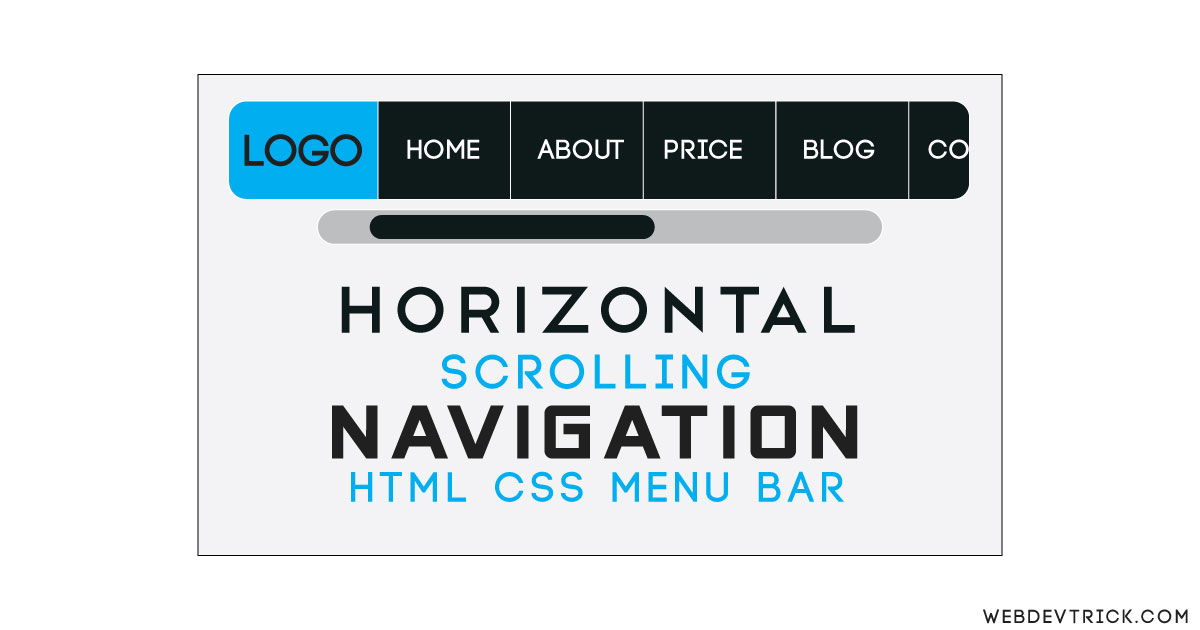
How we can create a scrolling navigation bar using HTML and CSS? Solution: Horizontal Scroll Navigation Using HTML CSS, Scrolling Menu Bar.
Previously I have shared some types of Navbar, But this is different from others. This menu has more content than its width, and all extra overflow materials are hidden. We can access all the items by scrolling left or right, but I have disabled the scrollbar. Now you can scroll using left and right arrow keys and in the phone, you can slide easily.
Today you will learn to create a Horizontal Scrolling Menu Bar with Pure CSS & HTML. In this menu, you have scroll left or right to see all the menu items. There are no navigation buttons for PC users, they have to scroll by pressing buttons on the keyboard. We also can add buttons but for that JavaScript is required, but I want to create with Pure CSS.
So, Today I am sharing Horizontal Scroll Navigation Using HTML CSS. This menu bar has a minimal design, some nav items with a fixed logo. You can use this on your website after some customization. If you want then you can show the scroll bar, I have hidden that element using CSS command.
If you are thinking now how this Scrolling Menu Bar actually is, then see the preview given below.
Preview Of Horizontal Scrolling Menu Bar
See this video preview to getting an idea of how this menu looks like.
Live DemoNow you can see this visually, there also a button above for seeing it live. If you like this, then get the source code of its.
You May Also Like:
Horizontal Scroll Navigation Using HTML CSS Source Code
Before sharing source code, Let’s talk about it. First I have created a main div and placed all the nav item inside it. For creating horizontal scrolling I have put max-height to hide some elements. And put box-sizing: border-box; in all the elements using CSS * selector (info). After that, for creating scrolling effect used overflow-x: auto; X for horizontal scrolling only.
For hiding the scroll bar I have used .scroll::-webkit-scrollbar {display: none;} , you can visible the scroll bar by removing this line. There are left many basic CSS properties like display, align, text, etc. I can explain all in writing, you will understand easily after getting the codes.
For creating this menu you have to create only 2 files, one for HTML and one for CSS. Follow the steps to creating this without any error.
index.html
Create an HTML file named ‘index.html‘ and put these codes given here below.
|
1 2 3 4 5 6 7 8 9 10 11 12 13 14 15 16 17 18 19 20 21 22 23 24 25 26 27 28 29 30 31 |
<!DOCTYPE html> <!--Code By Webdevtrick ( https://webdevtrick.com )--> <html lang="en" > <head> <meta charset="UTF-8"> <title>Horizontal Scroll Nav | Webdevtrick.com</title> <link rel="stylesheet" href="https://cdnjs.cloudflare.com/ajax/libs/normalize/5.0.0/normalize.min.css"> <link rel="stylesheet" href="style.css"> </head> <body> <div class="container nav"> <div class="info">On desktop control with left and right keys</div> <header class="nav-header"> <span class="logo"><img src="http://pngimg.com/uploads/google/google_PNG19644.png"></span> <nav class="middle scroll"> <span class="item">Home</span> <span class="item">About</span> <span class="item">Portfolio</span> <span class="item">Pricing</span> <span class="item">Services</span> <span class="item">Contact</span> <span class="item">Blog</span> <span class="item">Help</span> </nav> </header> </div> </body> </html> |
style.css
Now create a CSS file named ‘style.css‘ and put the codes given here.
|
1 2 3 4 5 6 7 8 9 10 11 12 13 14 15 16 17 18 19 20 21 22 23 24 25 26 27 28 29 30 31 32 33 34 35 36 37 38 39 40 41 42 43 44 45 46 47 48 49 50 51 52 53 54 55 56 57 58 59 60 61 62 63 64 65 66 67 68 69 70 71 72 |
/** Code By Webdevtrick ( https://webdevtrick.com ) **/ * { box-sizing: border-box; user-select: none; } body { max-width: 760px; margin: 10vmin auto 0; color: #fff; line-height: 1.5; } .info{ text-align: center; font-size: 24px; color: #212121; text-transform: capitalize; } .nav-header .logo { width: 25%; } .nav-header nav { width: 75%; } header { background: #212121; } .nav-header { border-radius: 5px; } .logo { text-align: center; border-right: 1px solid #4d4d4d; padding: 12px 24px 13px; } .logo img { width: 100%; display: inline-block; vertical-align: middle; } .item { padding: 12px 16px 13px; } .item:not(:last-child) { border-right: 1px solid #7e7e7e; } header, nav { font-size: 0; } .item { font-size: 24px; } .logo, .item, .middle { display: inline-block; vertical-align: middle; } .scroll { white-space: nowrap; overflow-x: auto; -webkit-overflow-scrolling: touch; -ms-overflow-style: -ms-autohiding-scrollbar; } .scroll::-webkit-scrollbar { display: none; } @media (max-width: 765px) { .item { font-size: 14px; } } |
That’s It. Now you have successfully created Horizontal Scrolling Navigation Using HTML CSS, Scroll Menu Bar. If you have any doubt or question comment down below.
Thanks For Visiting, Keep Visiting.



Hi I need your help, I have been learning and following you for a while now.
I want to embark on a payment integration system project.
But I’m wondering if I will be able to do it html css and Javascript?
Can you help me?