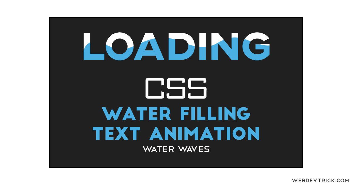
How we can create a water fill effect on a text using CSS? Solution: CSS Water Filling Text Animation With Waves, Water Wave Mask on Text.
Previously I have shared Direction Fill Effect On Hover, now its time for water type filling. This designs its something like text mask with GIF, but it is with a static PNG image. The combination of water and wave effects creates a cool animation, and you can use it in many places.
Today you will learn to crate Water Wave Text Mask using HTML and CSS3. There is a moving water waves animation inside the text with infinity repeat. You also can use this as a loading screen animation, this will look good also in that place. This design is customizable, you can change color, animation, text, etc.
So, Today I am sharing CSS Water Filling Text Animation With Waves. I have created this using pure HTML and CSS, this is without JavaScript and any library. I think this will work only lastest browsers or newest versions for chrome, edge, Mozilla, etc. Because outdated browsers do not support many CSS3 properties.
If you are thinking now how this water wave animation actually is, then see the preview given below.
Preview Of Water Wave Text Mask
See this video preview to getting an idea of how this animation looks like.
Live ViewNow you can see this visually, also you can see it live by pressing the button given above. If you like this, then get the source code of its.
You May Also Like:
- CSS Multi Layer Navigation
- One Page Portfolio Template
- Horizontal Scroll Navigation
- HTML CSS Pagination Design
CSS Water Filling Text Animation With Waves Source Code
Before sharing source code, let’s talk about it. As you can see in the preview, there are two types of text animation. There is only a difference in the image color I have used. First I have created an HTML div and put text inside it, I gave two CSS class named in the div. First’s name is loading and the second is wave. Now its looks like this: <div class="loading wave"> .
Now using CSS I have placed the text on the right place. There is two class on our div, using the first “loading” class I have placed the text and gave font-size, font-family, height, width, position, etc. Using the second class “wave” I have created the animation and masking. I have used the clipping mask method with text and put the PNG image in the background.
For creating the mask I have used CSS background-clip: text; command (info), and put the color transparent. After that, I have created two animations using CSS @keyframe . One animation for creating waves and another for go up and then down, I have placed these two animations with infinite and linear.
Left all other things you will understand after getting the codes, I can’t explain all in writing. For creating this animation you have to create only 2 files, one for HTML and one for CSS. Follow the steps to creating this without any error.
index.html
Create an HTML file named ‘index.html‘ and put these codes given here below.
|
1 2 3 4 5 6 7 8 9 10 11 12 13 14 15 16 17 18 19 20 |
<!DOCTYPE html> <!--Code By Webdevtrick ( https://webdevtrick.com )--> <html lang="en" > <head> <meta charset="UTF-8"> <title>Water Fill On Text | Webdevtrick.com</title> <link rel="stylesheet" href="style.css"> <script src="https://cdnjs.cloudflare.com/ajax/libs/prefixfree/1.0.7/prefixfree.min.js"></script> <link href="https://fonts.googleapis.com/css?family=Lexend+Deca&display=swap" rel="stylesheet"> </head> <body> <div class="loading wave"> Loading </div> <div class="loading2 wave2"> Loading </div> </body> </html> |
style.css
Now create a CSS file named ‘style.css‘ and put these codes given here.
|
1 2 3 4 5 6 7 8 9 10 11 12 13 14 15 16 17 18 19 20 21 22 23 24 25 26 27 28 29 30 31 32 33 34 35 36 37 38 39 40 41 42 43 44 45 46 47 48 49 50 51 52 53 54 55 56 57 58 59 60 61 62 63 64 65 66 67 68 69 70 71 72 73 |
/** Code By Webdevtrick ( https://webdevtrick.com ) **/ body { background: #212121; width: 100%; height: 100%; } .loading, .loading2 { text-transform: uppercase; font-family: 'Lexend Deca', sans-serif; font-weight: bold; font-size: 100pt; text-align: center; height: 120px; line-height: 110px; vertical-align: bottom; position: absolute; left: 0; right: 0; top: 100px; bottom: 0; display: block; } .loading2 { top: 240px; } .wave { background-image: url("https://webdevtrick.com/wp-content/uploads/water-wave-blue.png"); -moz-background-clip: text; -o-background-clip: text; -webkit-background-clip: text; background-clip: text; color: transparent; text-shadow: 0px 0px rgba(255, 255, 255, 0.06); animation: wave-animation 1s infinite linear, loading-animation 10s infinite linear alternate; background-size: 200px 100px; background-repeat: repeat-x; opacity: 1; } .wave2 { background-image: url("https://webdevtrick.com/wp-content/uploads/water-wave.png"); -moz-background-clip: text; -o-background-clip: text; -webkit-background-clip: text; background-clip: text; color: transparent; text-shadow: 0px 0px rgba(255, 255, 255, 0.06); animation: wave-animation 1s infinite linear, loading-animation 10s infinite linear alternate; background-size: 200px 100px; background-repeat: repeat-x; opacity: 1; } @keyframes wave-animation { 0% { background-position: 0 bottom; } 100% { background-position: 200px bottom; } } @keyframes loading-animation { 0% { background-size: 200px 0px; } 100% { background-size: 200px 200px; } } @media (max-width: 765px) { .loading, .loading2 { font-size: 50pt; } } |
That’s It. Now you have successfully created CSS Water Filling Text Animation With Waves, Water Wave Text Mask. If you have any doubt or question comment down below.
Thanks For Visiting, Keep Visiting.

Explain about the page loading in html.