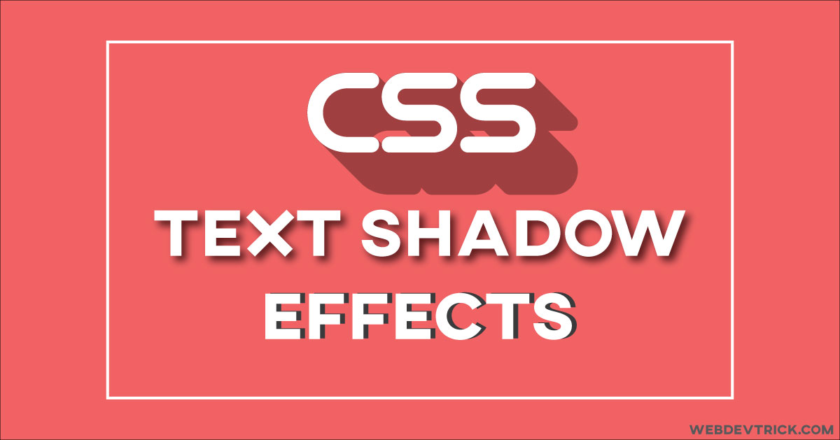
How we can create different kinds of text-shadow effect using CSS3? Solution: See This CSS Text Shadow Effect – Elegant, Deep, Insert, Retro Effects.
I am sure that, You have seen many types of shadow effects on text. Using shadow you can give a text 3D effect & many other kinds of effects. Mostly designers and developers use cool shadow effects to create a unique design on the webpage. A good shadow creates an object more attractive.
Now question is that there is one property for creating text-shadow, but how we can create different kinds of shadow using this single property? The answer is simple, changing colors and distance value in shadow property. We can create more interesting concepts like this using CSS3. In some shadow effect, we have to put many distances and color value. For creating a cool shadow effect, make sure you must have creativity and patience.
So, Today I am sharing 4 types of CSS Text Shadow Effect, Elegant Shadow, Deep Shadow, Insert Shadow, & Retro Shadow effect. As I told before, these multiple effects based on different colors on different positions. Some peoples don’t know these effects by name, but they know the effect looks visually. Like elegant shadow called long shadow effect in simple words.
If you don’t get how these effects actually are, then see the preview given below.
Preview Of Elegant, Deep, Insert, Retro Shadow Effects
See this video preview to getting an idea of how the effects look like.
Now you can see this program visually. If you like this then get the source code of its.
You May Also Like:
- CSS Circular Menu With Icons
- Text Glitch Effect With HTML CSS
- HTML CSS JavaScript Calendar
- Responsive Navigation Bar
CSS Text Shadow Effects Source Code
Before sharing source code, let’s talk about this. First I want to talk about what things and properties I used to create is CSS Text Shadow Effects. I used CSS text-shadow property for creating the shadow. And I used letter-spacing property to make text and shadow clear and visible.
First, understand the text-shadow property, Suppose there you put text-shadow: 1px -2px 0 #767676; in CSS value. The first 1px is for margin left, and the second -2px for margin-top and the last 0 value is for blur effect (more info). you can change the 0 value for creating a blur effect. At the last, this is a code of color, which is for shadow color.
That’s the whole things which this effects based on. You can understand easily after seeing the codes. You have to create only 2 files to create this, one for HTML and one for CSS. Follow the steps to creating this without any error.
index.html
Create an HTML file named ‘index.html‘ and put these codes given here below.
|
1 2 3 4 5 6 7 8 9 10 11 12 13 14 15 16 17 18 19 |
<!DOCTYPE html> <html> <!-- code by webdevtrick ( https://webdevtrick.com ) --> <head> <meta charset="UTF-8"> <title>CSS Text Shadow Effects</title> <link href="https://fonts.googleapis.com/css?family=Bungee&display=swap" rel="stylesheet"> <link href="style.css" rel="stylesheet"> </head> <body> <h1 class="elegant-shadow">Elegant Shadow</h1> <h1 class="deep-shadow">Deep Shadow</h1> <h1 class="inset-shadow">Inset Shadow</h1> <h1 class="retro-shadow">Retro Shadow</h1> </body> </html> |
style.css
Now create a CSS file named ‘style.css‘ and put the codes.
|
1 2 3 4 5 6 7 8 9 10 11 12 13 14 15 16 17 18 19 20 21 22 23 24 25 26 27 28 29 30 31 32 |
h1 { font-family: 'Bungee', cursive; font-size: 92px; padding: 80px 50px; text-align: center; text-transform: uppercase; text-rendering: optimizeLegibility; } h1.elegant-shadow { color: #131313; background-color: #e7e5e4; letter-spacing: 0.15em; text-shadow: 1px -1px 0 #767676, -1px 2px 1px #737272, -2px 4px 1px #767474, -3px 6px 1px #787777, -4px 8px 1px #7b7a7a, -5px 10px 1px #7f7d7d, -6px 12px 1px #828181, -7px 14px 1px #868585, -8px 16px 1px #8b8a89, -9px 18px 1px #8f8e8d, -10px 20px 1px #949392, -11px 22px 1px #999897, -12px 24px 1px #9e9c9c, -13px 26px 1px #a3a1a1, -14px 28px 1px #a8a6a6, -15px 30px 1px #adabab, -16px 32px 1px #b2b1b0, -17px 34px 1px #b7b6b5, -18px 36px 1px #bcbbba, -19px 38px 1px #c1bfbf, -20px 40px 1px #c6c4c4, -21px 42px 1px #cbc9c8, -22px 44px 1px #cfcdcd, -23px 46px 1px #d4d2d1, -24px 48px 1px #d8d6d5, -25px 50px 1px #dbdad9, -26px 52px 1px #dfdddc, -27px 54px 1px #e2e0df, -28px 56px 1px #e4e3e2; } h1.deep-shadow { color: #e0dfdc; background-color: #333; letter-spacing: 0.1em; text-shadow: 0 -1px 0 #fff, 0 1px 0 #2e2e2e, 0 2px 0 #2c2c2c, 0 3px 0 #2a2a2a, 0 4px 0 #282828, 0 5px 0 #262626, 0 6px 0 #242424, 0 7px 0 #222, 0 8px 0 #202020, 0 9px 0 #1e1e1e, 0 10px 0 #1c1c1c, 0 11px 0 #1a1a1a, 0 12px 0 #181818, 0 13px 0 #161616, 0 14px 0 #141414, 0 15px 0 #121212, 0 22px 30px rgba(0, 0, 0, 0.9); } h1.inset-shadow { color: #202020; background-color: #2d2d2d; letter-spacing: 0.1em; text-shadow: -1px -1px 1px #111, 2px 2px 1px #363636; } h1.retro-shadow { color: #2c2c2c; background-color: #d5d5d5; letter-spacing: 0.05em; text-shadow: 4px 4px 0px #d5d5d5, 7px 7px 0px rgba(0, 0, 0, 0.2); } |
That’s It. Now you have successfully created 4 types of CSS Text Shadow Effect. If you have any doubt or question comment down below.
Thanks For Visiting, Keep Visiting.
