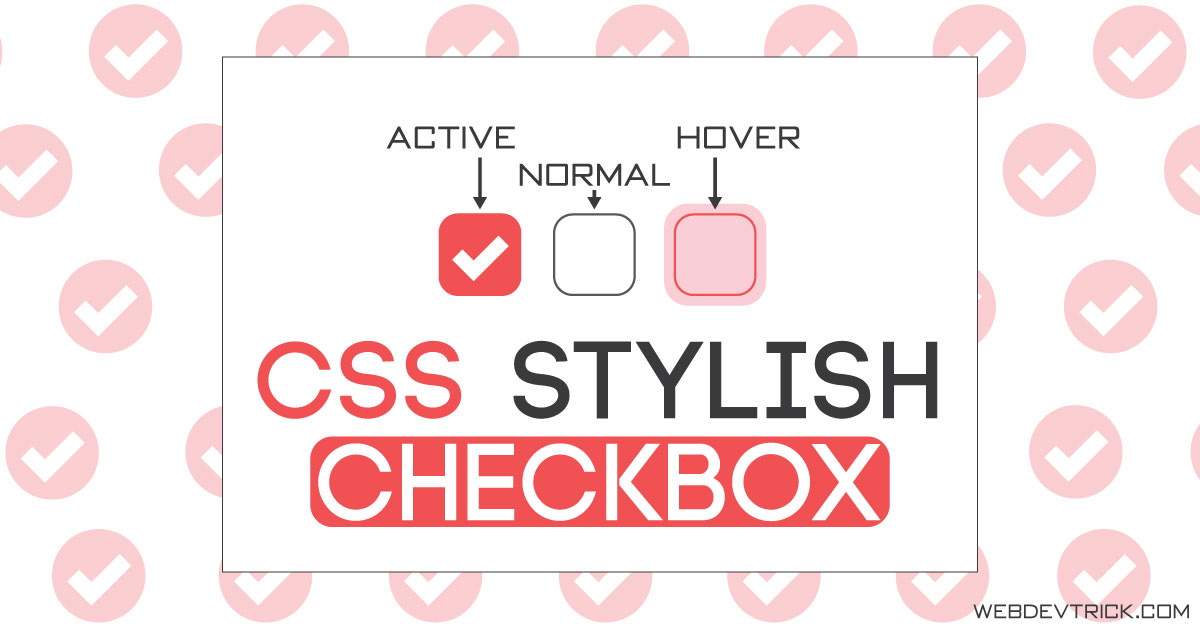
How we can create a stylish checkbox with an animated tick mark using HTML & CSS? Solution: Check out this CSS Style Checkbox With Animated Tick Mark, a Pure CSS Input Checkbox with stylish layout.
I am sure that, you have seen some animated checkboxes on multiple websites. Most websites use tick mark on their checkbox, some use different icons. Usually, websites use default jQuery or bootstrap‘s checkbox on websites, because for creating those you just have to put class or id name.
Today you will learn to create an animated & stylish checkbox using pure CSS. This one has minimal design and pretty good UI. You can use it on your websites after some changes as you want. It has a hover effect, animation effect, custom SVG tick icon, what you want now form only HTML & CSS? Previously I shared a custom radio button program, If you don’t saw that then you can checkout.
So, Today I am sharing CSS Style Checkbox With Animated SVG Tick Mark. In other words, Pure CSS Stylish Input Checkbox With Hover & Animation Effect. This animated checkbox built in pure CSS & HTML, without JavaScript or any library. I used a custom created SVG tick icon for the checked checkboxes.
If you are thinking now how these stylish checkboxes actually are, then see the preview given below.
Preview Of Responsive Animated Checked & Unchecked Input Checkbox
See this video preview to getting an idea of how these boxes look like.
Now you can see these input checkboxes visually. If you like these, then get the source code of its.
You May Also Like:
- Highlight Active Link Using HTML CSS JS
- CSS Floating Social Share Buttons
- Text Shadow Effects
- Dark & Light Mode With HTML CSS
Animated CSS Style Checkbox Source Code
Before sharing source code, let’s talk about it. First I created the tick icons using SVG, I put the SVG’s class “tick-icon” & ID “check-tick“. Then I created a checkbox input using <input type="checkbox"> with a unique ID. Suppose I put ID name “Design” on input, Now created a label & gave the ID name in for section example: <label for="Design">.
After that, I placed SVG value inside the label, First I put SVG’s width & height then placed the SVG value I created first. This step looks like this: <use xlink:href="#check-tick"></use>. The <use> element takes nodes from within the SVG document and duplicates them somewhere else (more info).
I put display: none; in all checkboxes first, because the tick mark will appear on click. In the CSS section, I placed all element on perfect positions. For creating toggle button function, I put this condition: when the input checked then background or border color will this( this is an example). On the second click, I put stroke-dashoffset: 0; now the checkbox will reset.
In the CSS section, I had put many styles and conditions like in every section I put transition: 0.4s to create animation effect, they are very basic. After getting the codes you will understand easily, There is nothing special to explain. For creating this pure CSS checkbox program, you have to create only 2 files. One for HTML & one for CSS, Follow the steps to creating this without any error.
index.html
Create an HTML file named ‘index.html‘ and put these codes given here below.
|
1 2 3 4 5 6 7 8 9 10 11 12 13 14 15 16 17 18 19 20 21 22 23 24 25 26 27 28 29 30 31 32 33 34 35 36 37 38 39 40 41 42 43 44 45 46 47 48 49 50 51 52 53 54 |
<!DOCTYPE html> <!-- code by webdevtrick ( https://webdevtrick.com ) --> <html> <head> <meta charset="UTF-8"> <title>CSS Stylish Checkbox</title> <meta name="viewport" content="width=device-width, initial-scale=1, maximum-scale=1"> <link href="https://fonts.googleapis.com/css?family=Julius+Sans+One&display=swap" rel="stylesheet"> <link href="style.css" rel="stylesheet"> </head> <body> <h1>Select Your Interests: </h1> <svg class="tick-icon"> <symbol id="check-tick" viewbox="0 0 12 10"> <polyline points="1.5 6 4.5 9 10.5 1"></polyline> </symbol> </svg> <input class="main" id="Design" type="checkbox" style="display: none;"/> <label class="inside-label" for="Design"><span> <svg width="12px" height="10px"> <use xlink:href="#check-tick"></use> </svg></span><span>Design</span></label> <input class="main" id="Development" type="checkbox" style="display: none;"/> <label class="inside-label" for="Development"><span> <svg width="12px" height="10px"> <use xlink:href="#check-tick"></use> </svg></span><span>Development</span></label> <input class="main" id="SEO" type="checkbox" style="display: none;"/> <label class="inside-label" for="SEO"><span> <svg width="12px" height="10px"> <use xlink:href="#check-tick"></use> </svg></span><span>SEO</span></label> <input class="main" id="Programming" type="checkbox" style="display: none;"/> <label class="inside-label" for="Programming"><span> <svg width="12px" height="10px"> <use xlink:href="#check-tick"></use> </svg></span><span>Programming</span></label> <input class="main" id="Coding" type="checkbox" style="display: none;"/> <label class="inside-label" for="Coding"><span> <svg width="12px" height="10px"> <use xlink:href="#check-tick"></use> </svg></span><span>Coding</span></label> </body> </html> |
style.css
Now create a CSS file named ‘style.css‘ & put these codes.
|
1 2 3 4 5 6 7 8 9 10 11 12 13 14 15 16 17 18 19 20 21 22 23 24 25 26 27 28 29 30 31 32 33 34 35 36 37 38 39 40 41 42 43 44 45 46 47 48 49 50 51 52 53 54 55 56 57 58 59 60 61 62 63 64 65 66 67 68 69 70 71 72 73 74 75 76 77 78 79 80 81 82 83 84 85 86 87 88 89 90 91 92 93 94 95 96 97 98 99 100 101 |
/** code by webdevtrick ( https://webdevtrick.com ) **/ * { box-sizing: border-box; } body { font-family: 'Julius Sans One', sans-serif; font-size: 16px; text-rendering: optimizeLegibility; color: #333; min-height: 100vh; display: flex; justify-content: center; align-items: center; } .inside-label { cursor: pointer; user-select: none; padding: 6px 8px; border-radius: 8px; overflow: hidden; transition: all 0.2s ease; } .inside-label:not(:last-child) { margin-right: 6px; } .inside-label:hover { background: #ffb9b9; } .inside-label span { float: left; vertical-align: middle; transform: translate3d(0, 0, 0); font-weight: 800; } .inside-label span:first-child { position: relative; width: 18px; height: 18px; border-radius: 4px; transform: scale(1); border: 2px solid #c8ccd4; transition: all 0.2s ease; } .inside-label span:first-child svg { position: absolute; top: 2px; left: 1px; fill: none; stroke: #fff; stroke-width: 2; stroke-linecap: round; stroke-linejoin: round; stroke-dasharray: 16px; stroke-dashoffset: 16px; transition: all 0.3s ease; transition-delay: 0.1s; transform: translate3d(0, 0, 0); } .inside-label span:last-child { padding-left: 8px; line-height: 18px; } .inside-label:hover span:first-child { border-color: #ff6060; } .main:checked + .inside-label span:first-child { background: #ff6060; border-color: #ff6060; animation: myAnimation 0.4s ease; } .main:checked + .inside-label span:first-child svg { stroke-dashoffset: 0; } .tick-icon { position: absolute; width: 0; height: 0; pointer-events: none; user-select: none; } @media screen and (max-width: 650px) { .inside-label { width: 100%; margin-bottom: 4px; display: inline-block; } body { width: auto; display: inherit; padding: 20px; } } @keyframes myAnimation { 50% { transform: scale(0.9); } } |
That’s It. Now you have successfully created CSS Style Checkbox With Animated Tick Mark. In other words, Pure CSS Animated Input Checkbox with SVG Icon. If you have any doubt or question comment down below.
Thanks For Visiting, Keep Visiting.



Excellent, congratulations. Very useful and necessary. Thank you
Thank You Very Much, Stay Connected.
Thanks shaan i regularly follow your blog excellent work!
Thank you very much, buddy. Visitors like you motivate me to post more, Stay Connected.