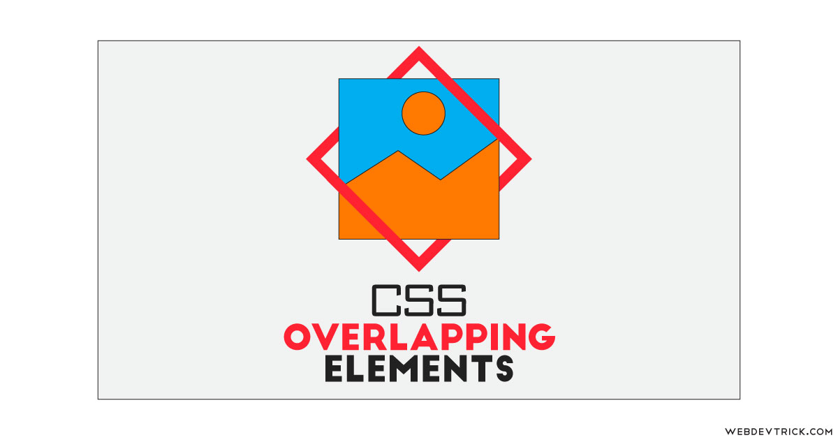
How we can create overlapping elements using HTML and CSS? Solution: See this CSS Overlapping Elements With Image and Shape, HTML CSS Overlap.
Previously I have shared many pure CSS programs, but this is about overlap contents using CSS. Basically, HTML pages are considered two-dimensional, because the text, images, and other elements are arranged on the page without overlap. But with the help of CSS position and z-index commands, we can create overlap effects like photoshop layers.
Today you will learn to create HTML CSS Overlap contents. Basically, there is a square size image and another square shape with only stroke or outline, not filled color. Now the outline overlapping the image by two sides, In other words, two sides of outline over the image and other two sides behind the image.
So, Today I am sharing CSS Overlapping Elements With Image and Shape. There I have used pure CSS and HTML to create this overlapping effect. The main things in this program are the CSS position and z-index commands. This is a good example of how we can use CSS commands to creating amazing stuff. Also, you can use this for creating awesome overlapping elements for your project.
If you are thinking now how this overlap contents actually is, then see the preview given below.
Preview Of HTML CSS Overlap
See this video preview to getting an idea of how this design looks like.
Live DemoNow you can see this visually, also you can see it live by pressing the button given above. If you like this, then get the source code of its.
You May Also Like:
CSS Overlapping Elements With Image and Shape Source Code
Before sharing source code, let’s talk about it. First using HTML I have created a picture tag and placed an IMG tag and span inside it. Basically, The <picture> tag gives web developers more flexibility in specifying image resources. In picture tag, I have stored the image in a variable using inline CSS. Also, I have linked the image in the IMG tag which is inside the picture tag, and the span for creating the border or outline.
Now using CSS I have placed elements in the right place, as you can see in the preview. Basically, there I have divided the image element into two parts using CSS :before and :after commands and in this part, I have set the background image by placing the variable which I have created in the HTML file.
Left all other things you will understand after getting the codes, I can’t explain all in writing. For creating this program you have to create just 2 files, one for HTML and one for CSS. Follow these steps to creating the program without any error.
index.html
Create an HTML file named ‘index.html‘ and put these codes given below.
|
1 2 3 4 5 6 7 8 9 10 11 12 13 14 15 16 17 18 19 |
<!DOCTYPE html> <!-- Code By Webdevtrick ( https://webdevtrick.com ) --> <html lang="en" > <head> <meta charset="UTF-8"> <title>Overlapping Elements | Webdevtrick.com</title> <link rel="stylesheet" href="https://cdnjs.cloudflare.com/ajax/libs/normalize/5.0.0/normalize.min.css"> <link rel="stylesheet" href="./style.css"> </head> <body> <picture class="wrap" style="--image: url(https://webdevtrick.com/wp-content/uploads/wire.jpg)"> <img src="https://webdevtrick.com/wp-content/uploads/wire.jpg" alt=""> <span class="border"></span> </picture> </body> </html> |
style.css
Now create a CSS file named ‘style.css‘ and put these codes given here.
|
1 2 3 4 5 6 7 8 9 10 11 12 13 14 15 16 17 18 19 20 21 22 23 24 25 26 27 28 29 30 31 32 33 34 35 36 37 38 39 40 41 42 43 44 45 46 47 48 49 50 51 52 53 54 55 56 57 58 59 |
/* Code By Webdevtrick ( https://webdevtrick.com ) */ body { display: grid; justify-content: center; align-items: center; height: 100vh; font-family: -apple-system, BlinkMacSystemFont, "Segoe UI", Helvetica, Arial, Ubuntu, sans-serif, "Apple Color Emoji", "Segoe UI Emoji", "Segoe UI Symbol"; } .wrap { position: relative; width: 60vh; display: block; } .wrap > img { box-shadow: 0 0 20px #bac3c3; } .wrap > * { height: 100%; width: 100%; display: block; } .wrap::before, .wrap::after{ content: ""; display: block; position: absolute; background-color: cyan; width: 50%; height: 50%; z-index: 1; background-image: var(--image); background-size: 200%; pointer-events: none; -webkit-user-select: none; -moz-user-select: none; -ms-user-select: none; user-select: none; } .wrap::after { bottom: 0; right: 0; background-position: right bottom; } .border { top: 0; position: absolute; box-sizing: border-box; border: 18px #e60023 solid; -webkit-transform: rotate(45deg); transform: rotate(45deg); } |
That’s It. Now you have successfully created CSS Overlapping Elements With Image and Shape, HTML CSS Overlap. If you have any doubt or questions comment down below.
Thanks For Visiting, Keep Visiting.
