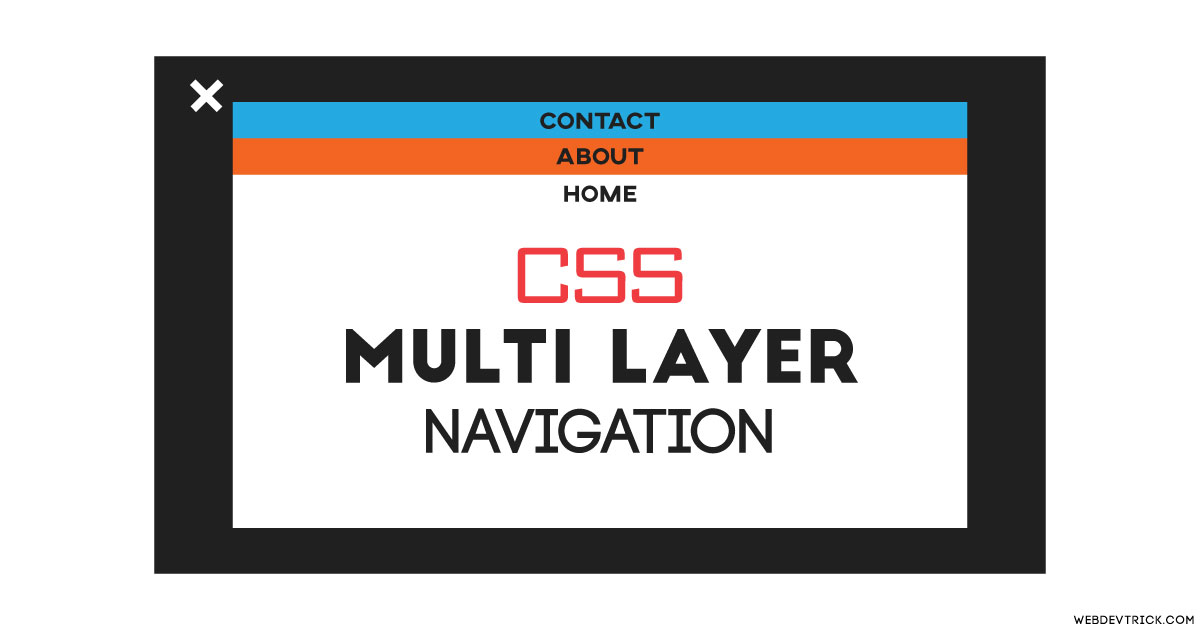
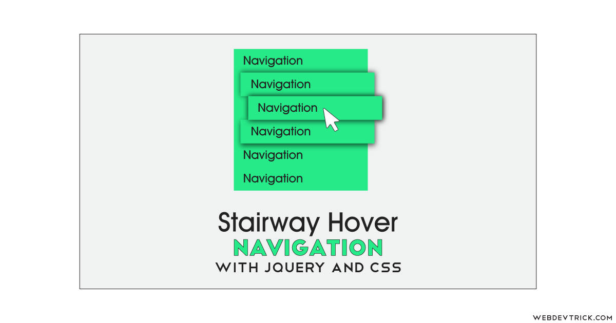
How we can create android’s recent tabs type navigation using HTML and CSS? Solution: See this CSS Multi Layer Navigation With Material Design, Recent Tasks Type Nav.
Maybe you have used or using android mobile, then you probably know about recent tasks. There is a dedicated button to see recent tasks in a layer-wise, and you call also switch and end tasks. Here the same layout we can design for menu navigation, this post is about that.
Today you will learn to create Android’s Recent Tasks Type Navigation. This is a pure CSS material design navigation with responsive view. I think you will like this design because that is something new in my opinion. Maybe you know about that, but this is a very easy and useful thing that beginners will understand easily.
So, Today I am sharing CSS Multi Layer Navigation With Material Design. I have used only HTML and CSS to create the design, there is no JS or any library. There is a menu icon that transforms into a cross or close button after click on that. You can click on the close button or click on any window to get a menu icon back.
If you are thinking now how this recent task type nav actually is, then see the preview given below.
Preview Of Recent Tasks Type Nav
See this video preview to getting an idea of how this design looks like.
Live ViewNow you can see this visually, you also can see it live by pressing the button given above. If you like this, then get the source code of its.
You May Also Like:
- SVG Button Hover Animation
- Border Transition Effects
- CSS Clip Path Transition Cards
- Pure CSS Dropdown Menu
CSS Multi Layer Navigation With Material Design Source Code
Before sharing source code, let’s talk about it. First I have created the main div for placing all sections. I have used HTML radio input for creating menu icons, and also placed in all section. As you can see in the preview the menu icon becomes cross on click, for creating this I have used CSS content:’ ‘ for creating the icon and on click its rotates.
After radio input, I have placed section using HTML <section> element. And I have used ID and for method to creating this, example: <input type="radio" id="home"> and <label for="home> (info). Now using CSS first I have done lots of basic works, like placing elements, color, font, transform, etc.
All the codes are basics but little complicated, you will understand easily after getting the codes. If you face any problem then you can ask me. For creating this navigation you have to create only 2 files, one for HTML and one for CSS. Follow the steps to creating this without any error.
index.html
Create an HTML file named ‘index.html‘ and put these codes given here below.
|
1 2 3 4 5 6 7 8 9 10 11 12 13 14 15 16 17 18 19 20 21 22 23 24 25 26 27 28 29 30 31 32 33 34 35 36 37 38 39 40 41 42 43 44 45 46 |
<!DOCTYPE html> <!--Code By Webdevtrick ( https://webdevtrick.com )--> <html lang="en" > <head> <meta charset="UTF-8"> <title>Material Navigation Pure CSS</title> <meta name="viewport" content="width=device-width"> <link rel='stylesheet' href='https://fonts.googleapis.com/css?family=Raleway:600,400,200,300'> <link rel="stylesheet" href="./style.css"> </head> <body> <div class="main"> <input type="radio" name="tab" id="menu"/> <div class="container"> <input type="radio" name="tab" checked="checked" id="home"/> <section class="home"> <h1>Home</h1> <label for="home"></label> </section> <input type="radio" name="tab" id="about"/> <section class="about"> <h1>About</h1> <label for="about"></label> </section> <input type="radio" name="tab" id="blog"/> <section class="blog"> <h1>Blog</h1> <label for="blog"></label> </section> <input type="radio" name="tab" id="contact"/> <section class="contact"> <h1>Contact</h1> <label for="contact"></label> </section> </div> <div class="menu"> <div> <label for="menu"></label> <label for="home"></label> </div> </div> </div> </body> </html> |
style.css
Now create a CSS file named ‘style.css‘ and put these codes.
|
1 2 3 4 5 6 7 8 9 10 11 12 13 14 15 16 17 18 19 20 21 22 23 24 25 26 27 28 29 30 31 32 33 34 35 36 37 38 39 40 41 42 43 44 45 46 47 48 49 50 51 52 53 54 55 56 57 58 59 60 61 62 63 64 65 66 67 68 69 70 71 72 73 74 75 76 77 78 79 80 81 82 83 84 85 86 87 88 89 90 91 92 93 94 95 96 97 98 99 100 101 102 103 104 105 106 107 108 109 110 111 112 113 114 115 116 117 118 119 120 121 122 123 124 125 126 127 128 129 130 131 132 133 134 135 136 137 138 139 140 141 142 143 144 145 146 147 148 149 150 151 152 153 154 155 156 157 158 159 160 161 162 163 164 165 166 167 168 169 170 171 172 173 174 175 176 177 178 179 180 181 182 183 184 185 186 187 188 |
/** Code By Webdevtrick ( https://webdevtrick.com ) **/ body { margin: 0; padding: 0; font-weight: 300; font-family: 'Raleway', sans-serif; background: #fff; overflow: hidden; transform-style: preserve-3d; } input[type='radio'], .hide { display: none; } input[type='radio']:checked + section { top: 0; } .container { width: 100%; height: 100vh; transition: all 500ms; transform-style: preserve-3d; } .container section { position: absolute; top: 100vh; width: 100%; height: 100vh; transition: top 500ms; transform-style: preserve-3d; } .container section.home { background: #2196f3; } .container section.about { background: #fd9d08; } .container section.blog { background: #ff3d3d; } .container section.contact { background: #5cb85c; } .container section h1 { margin: 0; font-size: 64px; transform: translate(0, 40vh); text-align: center; color: rgba(255,255,255,0.85); transition: transform 500ms; transform-style: preserve-3d; } .container section label { display: block; position: absolute; top: 0; width: 100%; height: 100vh; } .menu { display: block; position: fixed; top: 20px; left: 25px; z-index: 1000; transform: 0deg; transition: all 200ms; width: 35px; height: 4px; background: rgba(0,0,0,0.25); } .menu::before, .menu::after { content: ''; display: block; position: absolute; width: 35px; height: 4px; background: rgba(0,0,0,0.25); transition: all 200ms; } .menu::before { top: 10px; } .menu::after { top: 20px; } .menu:hover { background: #fff; } .menu:hover::before, .menu:hover::after { background: #fff; } .menu div, .menu div label:nth-child(1) { display: block; width: 35px; height: 35px; position: absolute; top: -6px; } .menu div label:nth-child(2) { display: none; } #menu:checked + .container { transform: scale(0.65) translateY(-18%); transition: all 500ms; transform-style: preserve-3d; } #menu:checked + .container section { cursor: pointer; overflow: hidden; opacity: 1; box-shadow: 0 0 40px rgba(0,0,0,0.25); transform-style: preserve-3d; } #menu:checked + .container section h1 { transform: scale(0.5); transform-style: preserve-3d; } #menu:checked + .container + .menu { top: 30px; left: 20px; transform: rotate(225deg); transition: all 200ms; transform-origin: center center; background: #646464; } #menu:checked + .container + .menu::before, #menu:checked + .container + .menu::after { background: #646464; transition: all 200ms; } #menu:checked + .container + .menu::before { opacity: 0; transition: opacity 0s; } #menu:checked + .container + .menu::after { margin-top: -20px; transform: rotate(90deg); } #menu:checked + .container + .menu div label:nth-child(2) { display: block; width: 35px; height: 35px; position: absolute; top: -6px; } #menu:checked + .container + .menu div label:nth-child(1) { display: none; } .container section.home { z-index: 99; } .container section.about { z-index: 98; } .container section.blog { z-index: 97; } .container section.contact { z-index: 96; } #menu:checked + .container section.home { top: 192px; } #menu:checked + .container section.home:hover { top: 188px; } #menu:checked + .container section.about { top: 132px; } #menu:checked + .container section.about:hover { top: 128px; } #menu:checked + .container section.blog { top: 72px; } #menu:checked + .container section.blog:hover { top: 68px; } #menu:checked + .container section.contact { top: 12px; } #menu:checked + .container section.contact:hover { top: 8px; } |
That’s It. Now you have successfully created CSS Multi Layer Navigation With Material Design, Recent Tasks Type Nav. If you have any doubt or question comment down below.
Thanks For Visiting, Keep Visiting.

