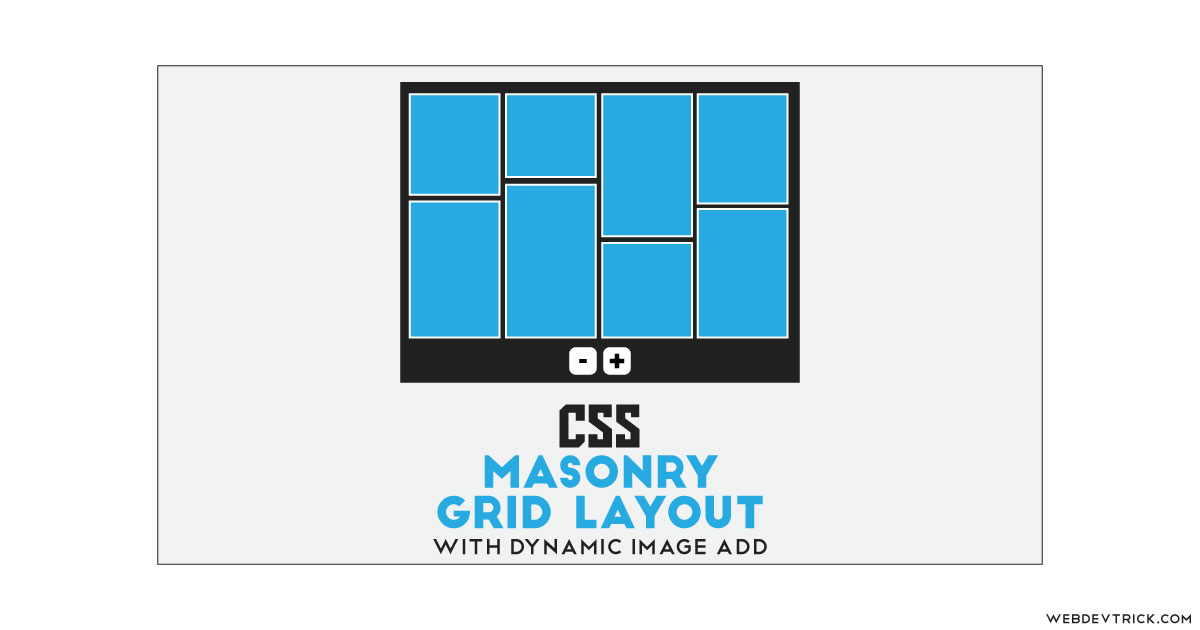
Want to create a flexbox based masonry grid layout using CSS? Solution: See this CSS Flex Grid Masonry Layout With Dynamic Image Add/Remove Feature.
Previously I have shared a masonry image grid, but this is with dynamic image add and remove features. Basically, Masonry is a grid layout based on columns. Unlike other grid layouts, it doesn’t have a fixed height of rows. Masonry layout optimizes the use of space inside the web page by reducing any unnecessary gaps. Without this type of layout, certain restrictions are required to maintain the structure of the layout. I am sure that you have seen this type of layout on many websites.
Today you will learn to create a dynamic image’s layout with add/remove image features. Basically, there is 6 images grid at first, Each column has 2 images one small and one big in height. At the bottom, there are 2 buttons for add and remove columns. When you will click on the add button then image columns will insert dynamically and if you click on the remove button then the grid column will disappear one by one.
So, Today I am sharing CSS Flex Grid Masonry Layout With Dynamic Image Add/Remove Feature. The grid layout completely based on CSS flexbox but the image insert and delete feature is based on JS. There is no library or frameworks like jQuery or anything else. You can use this on any image sharing website or on the portfolio section.
If you are thinking now how this flexbox image grids actually are, then see the preview given below.
Preview Of Dynamic Masonry Image Grids
See this video preview to getting an idea of how this design looks like.
Now you can see this visually, also you can see it live by pressing the button given above. If you like this, then get the source code of its.
You May Also Like:
CSS Flex Grid Masonry Layout Source Code
Before sharing source code, let’s talk about it. First I have the main div and put another div, 6 images, and 2 buttons inside the div. At first, I have manually placed 6 images using HTML <img src=""> tag, later JavaScript will add more images dynamically on the action. And Inside the button, I have placed simple plus and minus text.
Now using CSS I have placed all the elements in the right place, as you can see in the preview. I gave 100% width and height to the main div and used CSS display: flex; command to creating the grids. Using CSS I have done many things like margin, padding, position, border, etc. Also using CSS :nth-child() property I gave heights to all the images randomly.
JavaScript is here only to remove and adding images. All the images are powered by unsplash.com and they provide random images in their service. Random images come with no like 1,2,3, etc after the slash, we have to put a number with an increment for getting more new random images. And there I have created a function for adding image on click and remove the image on the minus button click.
Left all other things you will understand after getting the codes, I can’t explain all in writing. For creating this program you have to create 3 files. First file for HTML, second for CSS, and the third file for JavaScript. Follow the steps to creating this without any error.
index.html
Create an HTML file named ‘index.html‘ and put these codes given below.
|
1 2 3 4 5 6 7 8 9 10 11 12 13 14 15 16 17 18 19 20 21 22 23 24 25 26 27 28 29 |
<!DOCTYPE html> <!-- Code By Webdevtrick ( https://webdevtrick.com ) --> <html lang="en" > <head> <meta charset="UTF-8"> <title>Dynamic Masonry Flex Grids | Webdevtrick.com</title> <link rel="stylesheet" href="style.css"> </head> <body> <div class="background"> <div class="container" data-container> <div class="grids" data-grids style="background-image: url('https://source.unsplash.com/random/1')">1</div> <div class="grids" style="background-image: url('https://source.unsplash.com/random/2')">2</div> <div class="grids" style="background-image: url('https://source.unsplash.com/random/3')">3</div> <div class="grids" style="background-image: url('https://source.unsplash.com/random/4')">4</div> <div class="grids" style="background-image: url('https://source.unsplash.com/random/5')">5</div> <div class="grids" style="background-image: url('https://source.unsplash.com/random/6')">6</div> </div> <div class="buttons"> <button data-remove>-</button> <button data-add>+</button> </div> </div> <script src="function.js"></script> </body> </html> |
style.css
Now create a CSS file named ‘style.css‘ and put these codes given here.
|
1 2 3 4 5 6 7 8 9 10 11 12 13 14 15 16 17 18 19 20 21 22 23 24 25 26 27 28 29 30 31 32 33 34 35 36 37 38 39 40 41 42 43 44 45 46 47 48 49 50 51 52 53 54 55 56 57 58 59 60 61 62 63 64 65 66 67 68 69 70 71 72 73 74 75 76 |
/* Code By Webdevtrick ( https://webdevtrick.com ) */ body { margin: 0; } .background { align-items: center; background: #212121; display: flex; flex-direction: column; height: 100vh; justify-content: center; width: 100vw; } button { background: white; border: 2px solid transparent; border-radius: 7px; color: #ff5050; cursor: pointer; font-size: 24px; font-weight: bold; padding: 10px 20px; margin-left: 10px; transition: background-color 0.2s ease, border-color 0.2s ease, color 0.2s ease; } button:hover { background-color: #ff5050; border: 2px solid white; color: white; } .container { background: #212121; box-sizing: border-box; display: flex; flex-flow: column wrap; height: 80vh; margin-bottom: 5vh; text-align: center; text-transform: uppercase; width: 90vw; } .grids { align-items: center; background: white; background-size: cover; border: 5px solid #ff5050; box-sizing: border-box; color: white; display: flex; flex-grow: 0; font-family: sans-serif; font-size: 30px; font-weight: bold; height: 50%; justify-content: center; outline: 5px solid white; text-shadow: 0 0 5px black; } .grids:nth-child(6n - 5) { height: 25%; } .grids:nth-child(6n-4) { height: 75%; } .grids:nth-child(6n-3) { height: 50%; } .grids:nth-child(6n-2) { height: 50%; } .grids:nth-child(6n-1) { height: 66.666%; } .grids:nth-child(6n) { height: 33.333%; } |
function.js
The final step, create a JavaScript file named ‘function.js‘ and put the codes.
|
1 2 3 4 5 6 7 8 9 10 11 12 13 14 15 16 17 18 19 20 21 22 23 24 25 26 |
// Code By Webdevtrick ( https://webdevtrick.com ) // JS only for adding image const add = document.querySelector('[data-add]'); const remove = document.querySelector('[data-remove]'); const grids = document.querySelector('[data-grids]'); const container = document.querySelector('[data-container]'); let number = 7; add.addEventListener('click', () => { const addgrids = grids.cloneNode(true); const image = `url('https://source.unsplash.com/random/${Math.floor(Math.random() * 100)}')`; addgrids.style.backgroundImage = image; addgrids.innerHTML = number; container.appendChild(addgrids); number++; }); remove.addEventListener('click', () => { if (container.childElementCount > 0) { container.removeChild(container.lastElementChild); } if (number > 1) { number--; } }); |
That’s It. Now you have successfully created CSS Flex Grid Masonry Layout With Dynamic Image Add/Remove Feature. If you have any doubt or question comment down below.
Thanks For Visiting, Keep Visiting.


please can you help me.. i want grid that is horizontally and vertically adding images after clicking button