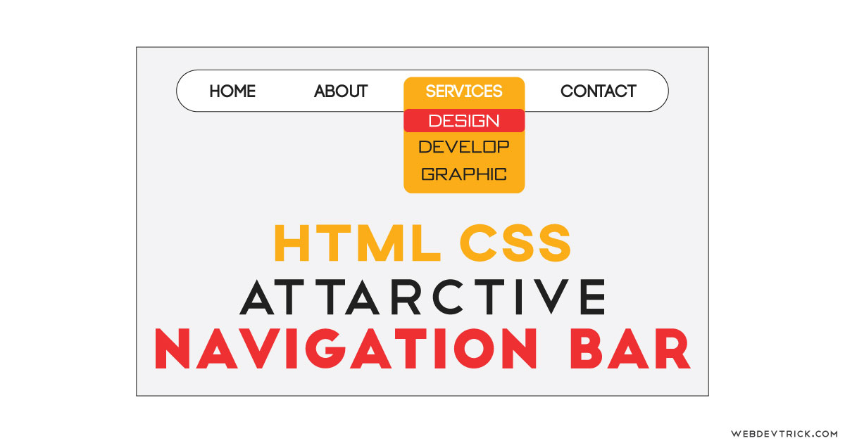
How we can create a flat and stylish navigation bar using HTML and CSS? Solution: CSS Flat Navigation Bar With Colorful Sub Menu, HTML CSS Flat Navbar.
Previously I have shared many types of Navbar, but it is a little different because it has a colorful UI. According to experts, Having easy-to-use navigation is important for any web site. Basically, Navigation bar contains very useful links of the website to help users.
Today you will learn to create Flat and Colorful Navbar. There is a flat and simple navigation bar, when you will hover then you will see the submenus with a colorful theme background. There is a color combination of dark yellow and light red that is used on the design. Note that, This is not a responsive navbar, this just a design concept.
So, Today I am sharing CSS Flat Navigation Bar With Colorful Sub Menu. Basically, there is a hover effect with a great color combination theme. That’s an HTML list based menu bar and placed and designed using CSS. This is only a UI design concept, if you seriously need a perfect navbar for your website, then check the link I have linked above this paragraph.
If you are thinking now how this flat navigation bar actually is, then see the preview given below.
Preview Of HTML CSS Flat Colorful Navbar
See this video preview to getting an idea of how this HTML CSS based navigation looks like.
Live DemoNow you can see this visually, also you can see it live by pressing the button given above. If you like this, then get the source code of its.
You May Also Like:
CSS Flat Navigation Bar With Colorful Sub Menu Source Code
Before sharing source code, let’s talk about it. First, I have used HTML <nav> tag, this is the official tag for creating navbar comes with HTML 5(info). As you know this is not a responsive design so, I have put values in pixels. For creating links and dropdown I have used HTML list <ul> <li> tags.
Now using CSS, I have placed all the elements by giving position, padding, margin, display, etc. I have used flex display in this design. After that, I put different colors for elements, like blue for links, and yellow sub-menus, and light red for hover sections. For creating attractive I have used different colors for the border on different sides. Like I have choosed the yellow color for sub-menu and put dark yellow on the border and more dark on the border-right and border-bottom.
Also applied the same border condition in hover effect with red color. These all are very basic stuffs, you will understand easily after getting the codes. For creating this design you have to create only 2 files, one for HTML and one for CSS. Follow the steps to creating this without any error.
index.html
Create an HTML file named ‘index.html‘ and put these codes given here below.
|
1 2 3 4 5 6 7 8 9 10 11 12 13 14 15 16 17 18 19 20 21 22 23 24 25 26 27 28 29 30 31 32 33 34 35 36 37 |
<!DOCTYPE html> <!--Code By Webdevtrick ( https://webdevtrick.com )--> <html lang="en" > <head> <meta charset="UTF-8"> <title>Stylish Navigation Bar | Webdevtrick.com</title> <link href="https://fonts.googleapis.com/css?family=Lexend+Deca&display=swap" rel="stylesheet"> <link rel="stylesheet" href="./style.css"> </head> <body> <nav> <ul> <li><a href="#">Home</a></li> <li> <a href="#">Codes</a> <ul> <li><a href="#">HTML</a></li> <li><a href="#">CSS</a></li> <li><a href="#">JavaScript</a></li> </ul> </li> <li> <a href="#">Services</a> <ul> <li><a href="#">Web Design</a></li> <li><a href="#">Web Development</a></li> <li><a href="#">Graphic Design</a></li> </ul> </li> <li><a href="#">About</a></li> <li><a href="#">Contact</a></li> </ul> </nav> </body> </html> |
style.css
Now create a CSS file named ‘style.css‘ and put these codes given here.
|
1 2 3 4 5 6 7 8 9 10 11 12 13 14 15 16 17 18 19 20 21 22 23 24 25 26 27 28 29 30 31 32 33 34 35 36 37 38 39 40 41 42 43 44 45 46 47 48 49 50 51 52 53 54 55 56 57 58 59 60 61 62 63 64 65 66 67 68 69 70 71 72 73 74 75 76 77 78 79 80 81 82 83 84 85 86 87 88 89 90 91 92 93 94 95 |
/** Code By Webdevtrick ( https://webdevtrick.com ) **/ body { background: #f3f3f3; font-family: 'Lexend Deca', sans-serif; } nav { position: absolute; top: 35px; left: 50%; transform: translateX(-50%); display: inline-block; border: 2px solid #EBECF1; background-color: white; border-radius: 30px; animation: slideIN 1s ease-out; } ul { position: relative; display: flex; flex: 1 1 auto; margin: 0; padding: 0 30px; list-style-type: none; } ul li:not(:last-child) { margin-right: 40px; } ul li { border: 2px solid transparent; border-radius: 5px; padding: 10px; transition: background 0.2s; } ul li a { color: #1da1f2; text-decoration: none; text-transform: uppercase; transition: color 0.2s; } ul li ul { visibility: hidden; opacity: 0; position: absolute; display: block; margin: 12px -12px; padding: 0; background: #fd9d08; border: 2px solid #F7C833; border-right: 2px solid #F89329; border-bottom: 2px solid #F89329; border-radius: 5px; transition: opacity 0.2s, visibility 0.2s; } ul li ul li { margin: -2px 0 0 -2px; width: calc(100% - 20px); line-height: 1.7; } ul li ul li a { color: #1da1f2; } ul li:hover { background: #ff3535; border: 2px solid #F05749; border-right: 2px solid #E02A21; border-bottom: 2px solid #E02A21; } ul li:hover a { color: #F9F8FD; } ul li:hover ul { visibility: visible; opacity: 1; box-shadow: 0px 3px 5px 2px #EBECF1; } ul li:hover ul li a { color: #F9F8FD; } @keyframes slideIN { 0% { top: -50px; } 40% { top: 20px; } 70% { top: 10px; } 100% { top: 15px; } } |
That’s It. Now you have successfully created CSS Flat Navigation Bar With Colorful Sub Menu, HTML CSS Flat Navbar with hover effect. If you have any doubt or question comment down below.
Thanks For Visiting, Keep Visiting.


Brother dropdown is not working with this source code… like… html ,Css,javascript.
Its working, and its just a design concept. That why its not responsive, if you want responsive then you can check other post previously I have shared.
It’s not responsive
I have said that in the post.
Thank You Shaan For This CSS Its Helpful
Hello Shaan. I am one of your follower.
I have couple questions to you if you can answer them.
First: according to nav element why did you use border and border-radius at the same time. And why you use I’ll and li twice like: ‘ul li ul li’.
The last question is how to remove the dots next to the list element.
Excuse me I’m a beginner.