How we can create a Gradient UI Card using HTML & CSS? Solution: CSS Card UI Design With Gradient. In other words, Pure CSS Gradient Card With Good UI.
I am sure that, you have seen many time of cards on multiple websites. Previously I had shared a card with images, If you don’t know about this then check it out first. Cards can be used in many places on the website like the blog post, profile card, etc.
Today you will learn to create a simple gradient card with many features like hover effect, low opacity background watermark. It has very fewer codes, & it is easy to understand also. If you are a beginner then you can also create this easily after seeing this post.
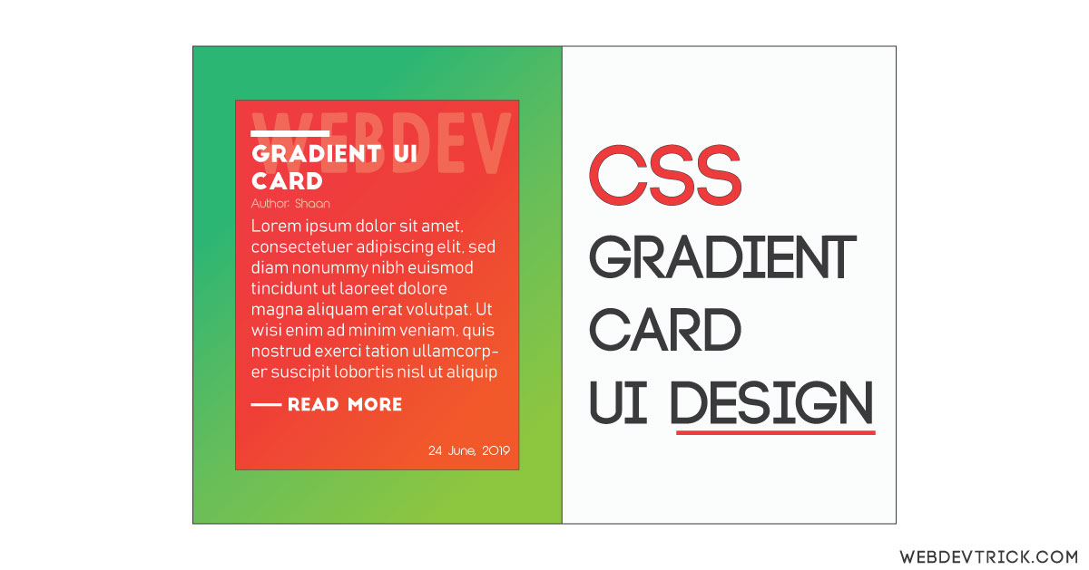
So, Today I am sharing CSS Card UI Design With Gradient, a pure CSS UI card. This UI card is designed for blog post preview, you can customize as you want. I placed title & a background text with low opacity. It also has a hover effect and published date, This is full static because of its a UI design. You can create it dynamic with the same design using the codes giving in this post.
If you are thinking now how this gradient card actually is, then see the preview given below.
Preview Of Gradient Cards
See this video preview to getting an idea of how these UI Cards looks like.
Now you can see this visually. If you like this, then get the source code of its.
You May Also Like:
- Inline Text To Grid Items On Hover
- Animated Newsletter Signup With Validation
- JavaScript Scroll To Top Feature
- Reveal Part Of Blurred Image
CSS Card UI Design With Gradient Source Code
Before sharing source code, let’s talk about this. I created the main div to put all the cards. Inside the card, I placed 6 things. First I created a div with class name g-card which is represented to gradient card. Inside the card, I put a background text you can see on preview which looks nice as a branding. Then I created a line you can see upperside of heading. After that, I place the heading, publisher name, text, read more link, & published date.
TO creating the background text as a watermark I just put low opacity in CSS. For the separater line above the heading, I put just width & height with a white background color. I used to different google fonts for heading and texts, All the cards & background has good gradient combinations you can change according to your choice.
The read more link has a hover effect, When you hover on the more button, then the line & text scale and animate left to right. I used the CSS @media query to create it responsive, I just put all the cards one by one to bottom in responsive design. I used cubic-bezier() Function to animate the line before read more button or link. The cubic-bezier() function defines a Cubic Bezier curve (more info).
I am sure that, You will fully understand the whole concept after getting the codes. If you got any trouble to understand or create then you can ask me for a solution. For creating these Gradient UI Cards you have to create on 2 files. One for HTML, & one for CSS. Follow the steps to creating this without any error.
index.html
Create an HTML file named ‘index.html‘ and put these codes given below.
|
1 2 3 4 5 6 7 8 9 10 11 12 13 14 15 16 17 18 19 20 21 22 23 24 25 26 27 28 29 30 31 32 33 34 35 36 37 38 39 40 41 42 43 44 45 46 47 48 49 50 51 52 53 54 55 56 57 58 59 60 61 62 63 64 65 66 67 68 69 |
<!DOCTYPE html> <!-- code by webdevtrick ( https://webdevtrick.com ) --> <html> <head> <meta charset="UTF-8"> <title>Gradient Colors</title> <link href="https://fonts.googleapis.com/css?family=Josefin+Sans|Rubik+Mono+One&display=swap" rel="stylesheet"> <link rel="stylesheet" href="style.css"> </head> <body> <div class="main"> <div class="g-card"> <div class="bg-text"><span>Webdev</span></div> <div class="seprate-line"></div> <h4 class="title">Gradient UI Cards</h4> <span class="publisher">Author: Shaan</span> <p>This is an example of pure CSS gradient UI Card, This one also has hover effect. If you want to check hover effect mouse over on read more button. For more programs like this visit my website webdevtrick.com. I post daily this kinds of program.</p> <a class="hover-btn" href="#"><span>Read More</span></a> <div class="date"> <span>24 June, 2019</span> </div> </div> <div class="g-card"> <div class="bg-text"><span>Webdev</span></div> <div class="seprate-line"></div> <h4 class="title">Gradient UI Cards</h4> <span class="publisher">Author: Shaan</span> <p>This is an example of pure CSS gradient UI Card, This one also has hover effect. If you want to check hover effect mouse over on read more button. For more programs like this visit my website webdevtrick.com. I post daily this kinds of program.</p> <a class="hover-btn" href="#"><span>Read More</span></a> <div class="date"> <span>24 June, 2019</span> </div> </div> <div class="g-card"> <div class="bg-text"><span>Webdev</span></div> <div class="seprate-line"></div> <h4 class="title">Gradient UI Cards</h4> <span class="publisher">Author: Shaan</span> <p>This is an example of pure CSS gradient UI Card, This one also has hover effect. If you want to check hover effect mouse over on read more button. For more programs like this visit my website webdevtrick.com. I post daily this kinds of program.</p> <a class="hover-btn" href="#"><span>Read More</span></a> <div class="date"> <span>24 June, 2019</span> </div> </div> <div class="g-card"> <div class="bg-text"><span>Webdev</span></div> <div class="seprate-line"></div> <h4 class="title">Gradient UI Cards</h4> <span class="publisher">Author: Shaan</span> <p>This is an example of pure CSS gradient UI Card, This one also has hover effect. If you want to check hover effect mouse over on read more button. For more programs like this visit my website webdevtrick.com. I post daily this kinds of program.</p> <a class="hover-btn" href="#"><span>Read More</span></a> <div class="date"> <span>24 June, 2019</span> </div> </div> </div> </body> </html> |
style.css
Now create a CSS file named ‘style.css‘ and put these codes.
|
1 2 3 4 5 6 7 8 9 10 11 12 13 14 15 16 17 18 19 20 21 22 23 24 25 26 27 28 29 30 31 32 33 34 35 36 37 38 39 40 41 42 43 44 45 46 47 48 49 50 51 52 53 54 55 56 57 58 59 60 61 62 63 64 65 66 67 68 69 70 71 72 73 74 75 76 77 78 79 80 81 82 83 84 85 86 87 88 89 90 91 92 93 94 95 96 97 98 99 100 101 102 103 104 105 106 107 108 109 110 111 112 113 114 115 116 117 118 119 120 121 122 123 124 125 126 127 128 129 130 131 132 133 134 135 136 137 |
/** code by webdevtrick ( https://webdevtrick.com ) **/ html { font-size: 62.5%; } body { font-size: 1.4rem; line-height: 1.5; margin: 0; padding: 0; } p { font-size: 1.36rem; font-family: 'Josefin Sans', sans-serif; } h4 { margin-top: 0px; font-size: 2.8rem; letter-spacing: -.1em; margin-bottom: 1em; } .main { background: linear-gradient( 135deg, #185a9d, #43cea2); width: 100%; padding-left: 16px; padding-right: 16px; min-height: 980px; float: left; } .bg-text { position: absolute; opacity: 0.2; letter-spacing: -.5rem; font-size: 10rem; font-weight: 700; top: -10px; font-family: 'Rubik Mono One', sans-serif; } .g-card p, h4, span { color: #fafafa; } .seprate-line { width: 20px; height: 3px; background: white; } .g-card { margin: auto; top: 100px; float: left; margin-left: 6%; position: relative; width: 320px; min-height: 400px; overflow: hidden; background: linear-gradient(135deg, #02aab0, #00cdac); padding: 60px 30px; box-sizing: border-box; border-radius: 4px; box-shadow: 20px 30px 50px 1px rgba(0,0,0,.3); } .publisher { font-family: 'Josefin Sans', sans-serif; color: #fafafa; opacity: .8; font-size: 1.3rem; } .date { font-family: 'Josefin Sans', sans-serif; opacity: .8; font-size: 1.3rem; width: 100%; position: relative; } .date span { color: #333; position: absolute; right: 0px; top: 1.5em; } .hover-btn { position: relative; display: inline-block; text-decoration: none; color: #fff; line-height: 1; padding-left: 26px; text-transform: uppercase; padding-bottom: 4px; font-size: 13px } @media (min-width: 800px) { .hover-btn { font-size:16px; padding-left: 36px } } .hover-btn::before { content: ''; display: block; position: absolute; height: 1px; background: currentColor; left: 0; width: 20px; top: 50%; margin-top: -1px; transition: transform .3s cubic-bezier(.42,.01,.23,1); transform-origin: left } .hover-btn:hover::before { transform: scaleX(1.333) } @media (min-width: 800px) { .hover-btn::before { width:30px } } .hover-btn span { display: inline-block; transition: transform .3s cubic-bezier(.42,.01,.23,1) } .hover-btn:hover span { transform: translateX(12px) } @media (min-width: 800px) { .hover-btn:hover span { transform: translateX(18px) } } @media (max-width: 765px) { .g-card { margin-left: 0; top: 0; margin-top: 35px; } } |
That’s It. Now you have successfully created CSS Cards UI Design With Gradient Background. In other words, Pure CSS cards with background gradient with good UI Design. If you have any doubt or question comment down below.
Thanks For Visiting, Keep Visiting.

