How we can create stylish breadcrumb design using CSS? Solution: CSS Breadcrumb Design, Stylish Breadcrumb Navigation UI Design with HTML & CSS.
If you run a blog or read blogs on a daily bases, then you probably know that what is breadcrumb. Basically, Breadcrumb is secondary navigation that shows your current web page’s location on the entire website or web app. You can see also in this post’s topside a breadcrumb to show that where you landed on my blog. See on the top of this post there is info which looks like this Home > Web Design > CSS > Post Title
This info shows you that you have landed on my post which is in CSS category inside the Web Design Category. You can click on these breadcrumb’s text info like you want to visit CSS category then click on CSS. Also, It helps search engines to show categories in the SERP or search result page.
Today you will learn to create a stylish animated breadcrumb UI design using CSS. If you are using any CMS like WordPress, then a basic design comes with your theme by default. Don’t worry you can modify those using this code, Just you have to understand the code that how to implement. You can also use this on other kinds of websites like dynamic with PHP or other serverside scripts, & with Bootstrap Based static site.
So, Today I am sharing a CSS Breadcrumb Design, that you will definitely like. This is a pure CSS based design that you can understand easily. The structure on this design is based on HTML list <ul> and <li> .
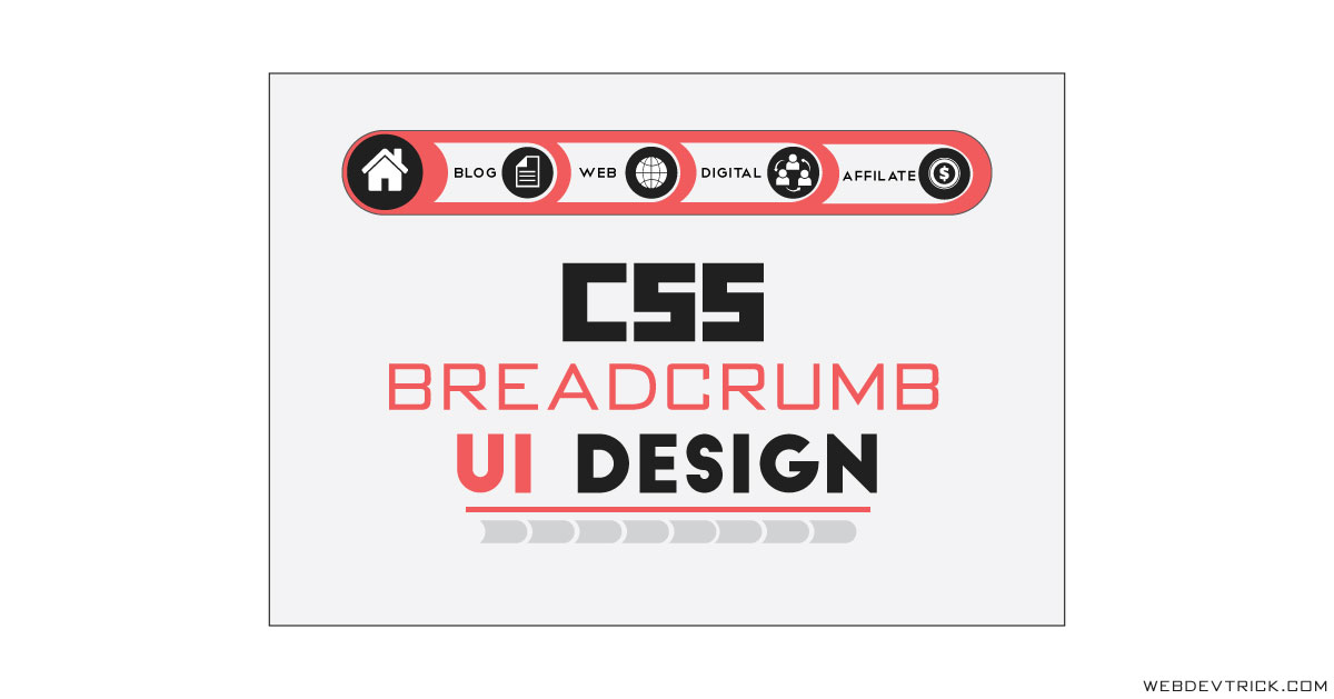
If you are thinking now how this design actually is, then see the preview given below.
Preview Of Animated Breadcrumb Navigation UI
See this video preview to getting an idea of how this animated breadcrumb design looks like.
Now you can see this visually. If you like this then get the source code of its.
You May Also Like:
- CSS Button Hover Effects
- Dropdown Menu With Submenu
- Stylish Blockquote Design
- Floating Social Share Buttons
CSS Breadcrumb Design Source Code
Before sharing source code, let’s talk about it. As you know for creating the structure I have used HTML list tags which are <ul> and <li>. You can see in the preview there is a specific icon for every section, for placing those icons I have used Font-Awesome (get) library. This has a hover effect as you can see this is based on CSS :hover property.
I have placed the icons with alignment using display: inline-block; command. In the hover effect, I have hidden all the text when you hover on any element that will expand & shows the text. For the home section, I have selected the section alone using :last-child property, I have placed these in descending order. In the preview, the first element placed on last in HTML file.
Left all other things you will understand easily after getting the codes. All codes are so easy even a beginner will understand easily. For creating this design you have to create only 2 files, One for HTML, & one for CSS. Follow the steps to creating this without any error.
index.html
Create an HTML file named ‘index.html‘ and put these codes given here below.
|
1 2 3 4 5 6 7 8 9 10 11 12 13 14 15 16 17 18 19 20 21 22 23 24 25 26 27 28 29 30 31 32 33 34 35 36 37 38 39 40 41 42 43 44 45 46 47 48 49 50 51 52 53 54 |
<!DOCTYPE html> <!--Code By Webdevtrick ( https://webdevtrick.com )--> <html lang="en" > <head> <meta charset="UTF-8"> <title>CSS Breadcrumb Design | Webdevtrick.com</title> <link href="https://stackpath.bootstrapcdn.com/font-awesome/4.7.0/css/font-awesome.min.css" rel="stylesheet"> <link href="https://fonts.googleapis.com/css?family=Quicksand&display=swap" rel="stylesheet"> <link rel="stylesheet" href="style.css"> </head> <body> <ul class="Bcrumb"> <li> <a href="#"> <i class="fa fa-bar-chart" aria-hidden="true"></i> <span class="text">CHARTS</span> </a> </li> <li> <a href="#"> <i class="fa fa-html5" aria-hidden="true"></i> <span class="text">HTML 5</span> </a> </li> <li> <a href="#"> <i class="fa fa-code" aria-hidden="true"></i> <span class="text">CODE</span> </a> </li> <li> <a href="#"> <i class="fa fa-rss" aria-hidden="true"></i> <span class="text">BLOG</span> </a> </li> <li> <a href="#"> <i class="fa fa-home" aria-hidden="true"></i> </a> </li> </ul> <h1>Stylish Bcrumb Design With HTML and CSS</h1> <span>By Admin - 16 July, 2019 <i class="fa fa-thumbs-up" aria-hidden="true"></i><i class="fa fa-twitter" aria-hidden="true"></i> </span> </body> </html> |
style.css
Now create a CSS file named ‘style.css‘ and put these codes.
|
1 2 3 4 5 6 7 8 9 10 11 12 13 14 15 16 17 18 19 20 21 22 23 24 25 26 27 28 29 30 31 32 33 34 35 36 37 38 39 40 41 42 43 44 45 46 47 48 49 50 51 52 53 54 55 56 57 58 59 60 61 62 63 64 65 66 67 68 69 70 71 72 73 74 75 76 |
/** Code By Webdevtrick ( https://webdevtrick.com ) **/ body { padding: 100px 100px; background-color: #fff; font-family: 'Quicksand', sans-serif; } ul.Bcrumb { display: inline-block; list-style: none; } ul.Bcrumb li { float: right; padding: 5px; background-color: #212121; border-radius: 50px; position: relative; margin-left: -50px; transition: all 0.2s; margin-top: 3px; } ul.Bcrumb li a { overflow: hidden; border-radius: 50px; transition: all 0.2s; text-decoration: none; height: 50px; width: 50px; background-color: #ff4b4b; text-align: center; min-width: 50px; display: block; line-height: 50px; padding-left: 52px; padding-right: 33.33333px; color: #fff; font-size: 18px; font-weight: 900; } ul.Bcrumb li a i { display: inline-block; } ul.Bcrumb li a .text { display: none; opacity: 0; } ul.Bcrumb li a:hover { width: 200px; background-color: #e60023; } ul.Bcrumb li a:hover .text { display: inline-block; opacity: 1; } ul.Bcrumb li:last-child a { padding: 0; } ul.Bcrumb li:last-child:hover { padding: 3px; margin-top: 0; } ul.Bcrumb li:last-child:hover a { width: 60px; height: 60px; line-height: 60px; } span i { margin-left: 5px; display: inline-block; } span i:nth-child(1) { color: #4267b2; } span i:nth-child(2) { color: #1da1f2; } |
That’s It. Now you have successfully created A stylish CSS Breadcrumb Design With Animated Hover Effect. If you any doubt or question comment down below.
Thanks For Visiting, Keep Visting.



Woo….. Amazing navigation bar your created mind and your web developer
Nice tutorial
Thanks