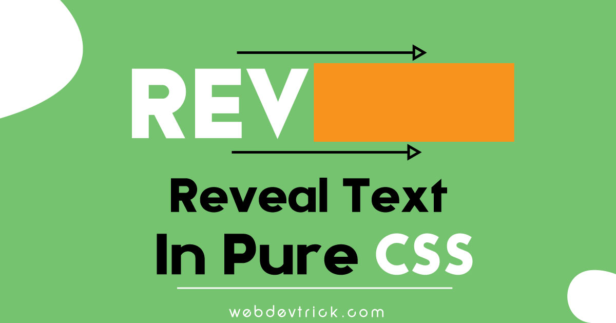
Animated Text Reveal In Pure CSS, Get Example With Source Code. You must have seen text reveal effect in many videos, even some website use these types of effect on their intro banner. Basically, this concept is: First add text, and add a shape over the text. then animate the shape left to right or right to left. When this animation will run with 2 or 3 seconds then the text reveal effect will create.
Where you can use animated text reveal? You can use it on your banner, about and footer section. This effect will be pretty good for any website. I had also previously shared dynamic website intro with HTML CSS & JavaScript, If you want an advance program then go for this. Otherwise, this program is also good.
So, Today I am sharing an Animated Text Reveal Program In Pure CSS. I created this program with only HTML and CSS, No javascript or jquery used. This a very basic and simple program but by looks it pretty enough. Let’s take a look at this program.
Preview and Example Of This Program
First, See how this program looks like, In this video.
Now you can see this program visually. If you like it, then go for source code.
You May Also Like:
Animated Text Reveal In Pure CSS Program Source Code
Before sharing source code, I want to say about this program a little bit. I just put one h1 tag for text, Left other work had done in CSS. Also, I put a rectangle over the text. Then animate the rectangles width 0 to 100 to 0 with the help of CSS keyframe and animation property. In other words, this program is fully based on CSS animation property, like animation-delay or animation-duration etc (know more about CSS animation ).
I have to create just 2 files for this program. One for HTML, & one for CSS, that’s all.
index.html
Create an HTML file named ‘index.html‘ and put these codes given here below.
|
1 2 3 4 5 6 7 8 9 10 11 12 13 14 15 16 17 18 |
<!DOCTYPE html> <!-- code by webdevtrick ( https://webdevtrick.com) --> <html> <head> <meta charset="UTF-8"> <title>Text Reveal In Pure CSS | Webdevtrick.com</title> <link rel="stylesheet" href="style.css"> </head> <body> <h1 class="reveal"> Webdevtrick.com </h1> </body> </html> |
style.css
Now create a CSS file named ‘style.css‘ and put these codes.
|
1 2 3 4 5 6 7 8 9 10 11 12 13 14 15 16 17 18 19 20 21 22 23 24 25 26 27 28 29 30 31 32 33 34 35 36 37 38 39 40 41 42 43 44 45 46 47 48 49 50 51 52 53 54 55 56 57 58 59 60 61 62 63 64 65 66 67 68 69 70 71 72 73 74 75 76 77 78 79 80 81 82 83 84 85 86 |
:root { --animation-delay: 0; --duration: 800ms; --iterations: 1; } /* code by webdevtrick ( https://webdevtrick.com) */ body { display: flex; align-items: center; justify-content: center; height: 100vh; background-color: #72BDED; flex-direction: column; } .reveal, .reveal::after { animation-delay: 0; animation-delay: var(--animation-delay, 2s); animation-iteration-count: 1; animation-iteration-count: var(--iterations, 1); animation-duration: 800ms; animation-duration: var(--duration, 800ms); animation-fill-mode: both; animation-timing-function: cubic-bezier(0.0, 0.0, 0.2, 1); } .reveal { position: relative; font-size: 6vw; animation-name: text; color: #FFF; white-space: nowrap; cursor: default; text-transform: uppercase; } .reveal::after { content: ""; position: absolute; z-index: 999; top: 0; left: 0; right: 0; bottom: 0; background-color: #f2f98b; transform: scaleX(0); transform-origin: 0 50%; pointer-events: none; animation-name: revealer; } @keyframes text { from { clip-path: inset(0 100% 0 0); } to { clip-path: inset(0 0 0 0); } } @keyframes revealer { 0%, 50% { transform-origin: 0 50%; } 60%, 100% { transform-origin: 100% 50%; } 60% { transform: scaleX(1); } 100% { transform: scaleX(0); } } |
That’s It. Now you have successfully create this program which is animated text reveal in pure CSS. If you have any doubt or question comment down below.
Thanks For Visiting, Keep Visiting.


Hello, is there any way to add these text animations to a video?