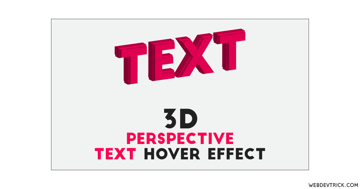
How we can create a 3d perspective hover effect for texts? Solution: See this Perspective Text Hover Effect With CSS and TweenMax, 3D Perspective Move.
Previously I have shared some perspective image slider, but this is for text. Basically, The perspective property defines how far the object is away from the user. And on hover its moves opposite the mouse direction. There is a dedicated CSS command perspective: to give its value or create the element. We can apply this command on image, div, or text also.
Today you will learn to create 3D perspective move animation. Basically, there is a text with 8 times repeat and all the 7 texts are placed behind the main text. And you can see the outline or stroke of the texts which are placed behind. When you will move mouse then the text will also move according to mouse direction. The text and other text which are in behind will move perspectively.
So, Today I am sharing Perspective Text Hover Effect With TweenMax CSS. There I have used HTML to create the layout, CSS for styling and tween max JS for animation. I think this is a pretty good hover effect for text, you can use this kind of 3d text on your header section. Also, you can use it anywhere on your website after changing the text.
If you are thinking now how this text hover effect actually is, then see the preview given below.
Preview Of 3D Perspective Move
See this video preview to getting an idea of how this text perspective hover effect looks like.
Live DemoNow you can see this program visually, also you can see it live by pressing the button given above. If you like this, then get the source code of its.
You May Also Like:
- Custom Radio Button Survey
- Search Bar Animation
- Stairway Hover Navigation
- Form UI Validation Animation
Perspective Text Hover Effect Source Code
Before sharing source code, let’s talk about it. First I have created the main div with class name ‘wrap’ and placed the text 7 times with the same class name and values. There are only these things we have to do in the HTML file. Also in the HTML file, I have linked other files like CSS and JavaScript.
Now using CSS I have placed all the elements in the right place, as you can see in the preview. There I have used flex display command to create the layout and used CSS perspective: command to create the effect. Also, I have used transform-style: preserve-3d; commnad to create the 3D effect.
TweenMax JS handling here the text movement function on hover. It fetched the text using document.querySelectorAll command and used .addEventListener command to detect mouse move. And put the command according to its pre-built functions. Left all other things you will understand after getting the codes, I can’t explain all in writing. For creating this program you have to create 3 files. First file for HTML, second for CSS, and third file for JavaScript.
Follow the steps to creating this program without any error.
index.html
Create an HTML file named ‘index.html‘ and put these codes given below.
|
1 2 3 4 5 6 7 8 9 10 11 12 13 14 15 16 17 18 19 20 21 22 23 24 25 26 27 28 29 30 |
<!DOCTYPE html> <!-- Code By Webdevtrick (https://webdevtrick.com) --> <html lang="en" > <head> <meta charset="UTF-8"> <title>Perspective Hover Effect Text | Webdevtrick.com</title> <link rel="stylesheet" href="https://cdnjs.cloudflare.com/ajax/libs/normalize/5.0.0/normalize.min.css"> <link rel="stylesheet" href="style.css"> </head> <body> <div class="wrap"> <div class="text">Perspective</div> <div class="text">Perspective</div> <div class="text">Perspective</div> <div class="text">Perspective</div> <div class="text">Perspective</div> <div class="text">Perspective</div> <div class="text">Perspective</div> <div class="text">Perspective</div> <div class="text">Perspective</div> <div class="text">Perspective</div> </div> <script src='https://cdnjs.cloudflare.com/ajax/libs/gsap/2.1.2/TweenMax.min.js'></script> <script src="function.js"></script> </body> </html> |
style.css
Now create a CSS file named ‘style.css‘ and put these codes given here.
|
1 2 3 4 5 6 7 8 9 10 11 12 13 14 15 16 17 18 19 20 21 22 23 24 25 26 27 28 29 30 31 32 33 34 |
/* Code By Webdevtrick (https://webdevtrick.com) */ body { height: 100vh; display: -webkit-box; display: flex; -webkit-box-pack: center; justify-content: center; -webkit-box-align: center; align-items: center; overflow: hidden; background-color: #208bfd; } .wrap { position: relative; -webkit-perspective: 100px; perspective: 100px; text-transform: uppercase; } .text { position: absolute; top: 0; left: 0; color: #0a81ff; font-size: 10vw; font-weight: bold; text-shadow: -1px -1px 0 #f0f0f0, 1px -1px 0 #f0f0f0, -1px 1px 0 #f0f0f0, 1px 1px 0 #f0f0f0; -webkit-transform-style: preserve-3d; transform-style: preserve-3d; } .text:first-child { position: relative; } |
function.js
The final step, create a JavaScript file named ‘function.js‘ and put the codes.
|
1 2 3 4 5 6 7 8 9 10 11 12 13 14 15 16 17 18 19 |
// Code By Webdevtrick (https://webdevtrick.com) const text = document.querySelectorAll('.text'); const halfX = window.innerWidth / 2; const halfY = window.innerHeight / 2; text.forEach((el, i) => { TweenMax.to(el, 1, { z: 1 * (i + 8) }); }); document.addEventListener('mousemove', e => { text.forEach((el, i) => { TweenMax.to(el, 0.5, { x: (e.clientX - halfX) * (i + 1) * 0.01, y: (e.clientY - halfY) * (i + 1) * 0.01 }); }); }); |
That’s It. Now you have successfully created Perspective Text Hover Effect With CSS Tweenmax, 3D Perspective Move Animation. If you have any doubt or question comment down below.
Thanks For Visiting, Keep Visiting.


