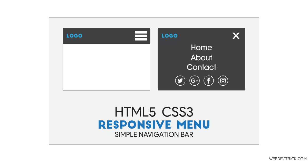
How we can create a responsive menu using pure HTML and CSS? Solution: See this HTML5 CSS3 Responsive Menu With Social Icons, Simple Navigation.
Previously I have shared many types of menu, but this is pure HTML 5 and CSS 3 based navigation. Basically, a navigation or menu section is required part of any website or web app. And menu contains important links such as home, about, contact, etc for help to navigate users. There are many types of fancy menu available in this blog, but this concept only with HTML5 and CSS3.
Today you will learn to create simple navigation. Basically there is a page with only a heading and a bar in the top which contains a logo text and hamburger menu icon. When you will click on the menu icon, then a full-page menu section will visible. The menu contains links like home, about, blog, etc and social media icons. There is an underline effect you will see when you will hover on any menu item.
So, Today I am sharing HTML5 CSS3 Responsive Menu With Social Icons. There I have used the latest version of pure HTML and CSS which known as HTML 5 and CSS 3 to create this program. There I have used a third-party icon library to place the icons of the social networks. If you are a beginner then this program will help you to understand how to create a menu.
If you are thinking now how this responsive menu actually is, then see the preview given below.
Preview Of Simple Navigation
See this video preview to getting an idea of how this navigation looks like.
Now you can see this program visually, also you can see it live by pressing the button given above. If you like this, then get the source code of its.
You May Also Like:
HTML5 CSS3 Responsive Menu Source Code
Before sharing source code, let’s talk about it. First I have created a nav section using HTML <nav> tag and the main section for heading. Inside the nav section, I have created a main div named container and input, label, and list inside it. The hamburger menu icon and social icons are based on font-awesome library. Also in the HTML file, I have linked the CSS file.
Now using CSS I have placed all the items in the right place, as you can see in the preview. There I have used input:checked method to open and close the menu. There I gave hover values like underline on menu items. I have used CSS transform command to transform the menu and cross icon on click. Left all other things you will understand after getting the codes, I can’t explain all in writing.
For creating this program you have to create only 2 files, one file for HTML and one file for CSS. Follow the steps to creating this program without any error.
index.html
Create an HTML file named ‘index.html‘ and put these codes given below.
|
1 2 3 4 5 6 7 8 9 10 11 12 13 14 15 16 17 18 19 20 21 22 23 24 25 26 27 28 29 30 31 32 33 34 35 36 37 38 39 40 41 42 43 44 45 46 47 48 49 50 51 52 53 54 55 56 57 58 59 60 61 62 63 64 65 66 67 68 |
<!DOCTYPE html> <!-- Code By Webdevtrick ( https://webdevtrick.com ) --> <html lang="en" > <head> <meta charset="UTF-8"> <title>Responsive HTML5 CSS3 Menu | Webdevtrick.com</title> <link rel="stylesheet" href="./style.css"> </head> <body> <nav> <div class="container"> <input id="responsive-menu" type="checkbox"> <label for="responsive-menu">Menu <span id="menu-icon"></span></label> <div id="overlay"></div> <ul> <li><a href="#">Home</a></li> <li><a href="#">About</a></li> <li><a href="#">Services</a></li> <li><a href="#">Pricing</a></li> <li><a href="#">Portfolio</a></li> <li><a href="#">Blog</a></li> <li><a href="#">Contact</a></li> </ul> <ul id="social-media"> <li> <a href="#"> <i class="fab fa-dribbble"></i> <span class="screen-reader-text">Dribbble</span> </a> </li> <li> <a href="#"> <i class="fab fa-codepen"></i> <span class="screen-reader-text">CodePen</span> </a> </li> <li> <a href="#"> <i class="fab fa-twitter"></i> <span class="screen-reader-text">Twitter</span> </a> </li> <li> <a href="#"> <i class="fab fa-linkedin"></i> <span class="screen-reader-text">LinkedIn</span> </a> </li> <li> <a href="#"> <i class="fab fa-instagram"></i> <span class="screen-reader-text">Instagram</span> </a> </li> </ul> </div> </nav> <main> <div class="container"> <h1>Responsive Menu</h1> </div> </main> </body> </html> |
style.css
Now create a CSS file named ‘style.css‘ and put these codes given here.
|
1 2 3 4 5 6 7 8 9 10 11 12 13 14 15 16 17 18 19 20 21 22 23 24 25 26 27 28 29 30 31 32 33 34 35 36 37 38 39 40 41 42 43 44 45 46 47 48 49 50 51 52 53 54 55 56 57 58 59 60 61 62 63 64 65 66 67 68 69 70 71 72 73 74 75 76 77 78 79 80 81 82 83 84 85 86 87 88 89 90 91 92 93 94 95 96 97 98 99 100 101 102 103 104 105 106 107 108 109 110 111 112 113 114 115 116 117 118 119 120 121 122 123 124 125 126 127 128 129 130 131 132 133 134 135 136 137 138 139 140 141 142 143 144 145 146 147 148 149 150 151 152 153 154 155 156 157 158 159 160 161 162 163 164 165 166 167 168 169 170 171 172 173 174 175 |
/* Code By Webdevtrick ( https://webdevtrick.com ) */ @import url(https://use.fontawesome.com/releases/v5.0.6/css/all.css); @import url(https://fonts.googleapis.com/css?family=Oswald:400|Raleway:400,700,400italic,700italic); *, *:before, *:after { box-sizing: border-box; } html, body { height: 100%; margin: 0; padding: 0; } body { background-color: #1d1f20; color: #e5e5e5; font: 16px/1.25 'Raleway', sans-serif; } h1 { font-family: 'Oswald', sans-serif; text-align: center; } .container { margin: 0 auto; max-width: 80em; } main .container { padding: 1em; } .screen-reader-text { clip: rect(1px 1px 1px 1px); clip: rect(1px, 1px, 1px, 1px); height: 1px; overflow: hidden; position: absolute !important; width: 1px; } nav { background: #e5e5e5; color: #1d1f20; left: 0; position: relative; top: 0; width: 100%; z-index: 9999; } /*** INPUT ***/ nav input { opacity: 0; position: absolute; z-index: -1; } /*** LABEL ***/ nav label { cursor: pointer; display: block; font: 2em/1 'Oswald', sans-serif; padding: 0.5em; } /* Hamburger Icon */ #menu-icon, #menu-icon:before, #menu-icon:after { background: #1d1f20; border-radius: 0.05em; height: 0.2em; transition: all 0.2s ease-in-out; width: 100%; } #menu-icon { display: inline-block; margin: 0.4em 0; max-width: 1em; position: relative; } nav label #menu-icon { float: right; } #menu-icon:before, #menu-icon:after { content: ''; left: 0; position: absolute; } #menu-icon:before { top: -0.4em; } #menu-icon:after { bottom: -0.4em; } /* Close Icon */ nav input[type=checkbox]:checked + label #menu-icon { background: transparent; } nav input[type=checkbox]:checked + label #menu-icon:before { top: 0; transform: rotate(-45deg); } nav input[type=checkbox]:checked + label #menu-icon:after { bottom: 0; transform: rotate(45deg); } /*** MENU ***/ /* Overlay */ nav input:checked ~ #overlay { background: #e5e5e5; bottom: 0; left: 0; height: 100vh; position: fixed; right: 0; top: 0; width: 100vw; z-index: -1; } /* List */ nav ul { font-size: 1.5em; list-style: none; margin: 0; max-height: 0; opacity: 0; overflow: hidden; padding: 0; text-align: center; } nav input:checked ~ ul { margin: 1em; max-height: inherit; opacity: 1; } nav ul > li { margin: 0.5em 0; } nav ul a { color: #1d1f20!important; text-decoration: none; } nav ul a:hover { text-decoration: underline; } /* Social Media */ nav ul#social-media > li { display: inline-block; font-size: 1.5em; margin: 0.5em; } |
That’s It. Now you have successfully created HTML5 CSS3 Responsive Menu With Social Icons, Simple Navigation. If you have any doubt or question comment down below.
Thanks For Visiting, Keep Visiting.


Hi Shaan,
Could you please tell me that how can I identify my menu bar is resposive or not in my website. Google search console says that your website is not mobile friendly.