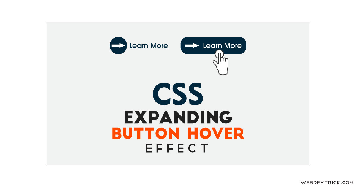
How we can create an expanding button on hover using HTML and CSS? Solution: See this CSS Expand Button On Hover Effect, Expanding Button With Icon.
Previously I have shared many buttons related programs and button hover effects, but this is about expanding button. These types of expanding buttons use many websites, in modern-days all webpage elements become fancy or good looking. You will see a simple text for navigation, but when you will hover on it then that will become a button.
Today you will learn to create Expanding Button With Icon. Basically, there is a button with an icon and a text and when you will hover on anything like a button or text then these two will merge and you will see a big single button. The small button covers the text on hover and pretends like a whole large button.
So, Today I am sharing CSS Expand Button On Hover Effect. There I have used pure CSS for creating the button effect, and layout is based on simple HTML. There are no JS or any other library, also the best fact of this program is icon also based on CSS. This program will be good practice for you of pure HTML & CSS, also you can use this button on your website by putting the link.
If you are thinking now how this expanding button actually is, then see the preview given below.
Preview Of Expanding Button
See this video preview to getting an idea of how this button looks like.
Now you can see this visually, also you can see it live by pressing the button given above. If you like this, then get the source code of its.
You May Also Like:
CSS Expand Button On Hover Effect Source Code
Before sharing source code, let’s talk about it. First, I have created a main div named container and placed all elements inside it. After that, I have placed a button tag inside the main div, and placed 3 spans inside the button. First span for circle, second for arrow icon, and the third for text. Also in the HTML file, I have linked the CSS file.
Now using CSS I have placed all the elements in the right place, as you can see in the preview. With CSS, first I gave the circle height, width, and border-radius and created the arrow icon using CSS :before and border, margin commands. There I have used transition for animation effect with cubic-bezier (info). On hover, the circle becomes 100% of width that is the main factor.
Also, I have done many more basic things using CSS that you will understand after getting the codes, I can’t explain all in writing. For creating this program you have to create 2 files one for HTML and one for CSS. Follow the steps to creating this without any error.
index.html
Create an HTML file named ‘index.html‘ and put these codes given below.
|
1 2 3 4 5 6 7 8 9 10 11 12 13 14 15 16 17 18 19 20 21 22 23 |
<!DOCTYPE html> <!-- Code By Webdevtrick (https://webdevtrick.com) --> <html lang="en" > <head> <meta charset="UTF-8"> <title>Button Hover</title> <link rel="stylesheet" href="style.css"> </head> <body> <div id="container"> <button class="btn"> <span class="circle"> <span class="icon arrow"></span> </span> <span class="button-text">Learn More</span> </button> </div> </body> </html> |
style.css
Now create a CSS file named ‘style.css‘ and put these codes given here.
|
1 2 3 4 5 6 7 8 9 10 11 12 13 14 15 16 17 18 19 20 21 22 23 24 25 26 27 28 29 30 31 32 33 34 35 36 37 38 39 40 41 42 43 44 45 46 47 48 49 50 51 52 53 54 55 56 57 58 59 60 61 62 63 64 65 66 67 68 69 70 71 72 73 74 75 76 77 78 79 80 81 82 83 84 85 86 87 88 89 90 91 92 93 94 95 96 97 98 99 100 101 102 103 104 105 106 107 108 109 110 111 112 113 114 115 116 |
/* Code By Webdevtrick (https://webdevtrick.com) */ @import url("https://fonts.googleapis.com/css?family=Mukta:700"); * { box-sizing: border-box; } *::before, *::after { box-sizing: border-box; } body { font-family: 'Mukta', sans-serif; font-size: 1rem; line-height: 1.5; display: flex; align-items: center; justify-content: center; margin: 0; min-height: 100vh; background: #f3f8fa; } button { position: relative; display: inline-block; cursor: pointer; outline: none; border: 0; vertical-align: middle; text-decoration: none; background: transparent; padding: 0; font-size: inherit; font-family: inherit; } button.btn { width: 12rem; height: auto; } button.btn .circle { transition: all 0.45s cubic-bezier(0.65, 0, 0.076, 1); position: relative; display: block; margin: 0; width: 3rem; height: 3rem; background: #282936; border-radius: 1.625rem; } button.btn .circle .icon { transition: all 0.45s cubic-bezier(0.65, 0, 0.076, 1); position: absolute; top: 0; bottom: 0; margin: auto; background: #fff; } button.btn .circle .icon.arrow { transition: all 0.45s cubic-bezier(0.65, 0, 0.076, 1); left: 0.625rem; width: 1.125rem; height: 0.125rem; background: none; } button.btn .circle .icon.arrow::before { position: absolute; content: ''; top: -0.25rem; right: 0.0625rem; width: 0.625rem; height: 0.625rem; border-top: 0.125rem solid #fff; border-right: 0.125rem solid #fff; -webkit-transform: rotate(45deg); transform: rotate(45deg); } button.btn .button-text { transition: all 0.45s cubic-bezier(0.65, 0, 0.076, 1); position: absolute; top: 0; left: 0; right: 0; bottom: 0; padding: 0.75rem 0; margin: 0 0 0 1.85rem; color: #282936; font-weight: 700; line-height: 1.6; text-align: center; text-transform: uppercase; } button:hover .circle { width: 100%; } button:hover .circle .icon.arrow { background: #fff; -webkit-transform: translate(1rem, 0); transform: translate(1rem, 0); } button:hover .button-text { color: #fff; } @supports (display: grid) { body { display: grid; grid-template-columns: repeat(4, 1fr); grid-gap: 0.625rem; grid-template-areas: ". main main ." ". main main ."; } #container { grid-area: main; align-self: center; justify-self: center; } } |
That’s It. Now you have successfully created CSS Expand Button On Hover Effect, Expanding Button With Icon. If you have any doubt or question comment down below.
Thanks For Visiting, Keep Visiting.


